

Poking at V-safe With a Long Stick
Poking at V-safe With a Long Stick
The much hailed God's Gift to Adverse Reaction Tracking... Ain't. But there could still be undigested kernels in the...

Earlier this month, after two FOIA lawsuits1, ICAN2 obtained a dump of some amount of V-safe3 data from the CDC. And they’ve made the data they received publicly available. Many have already reported — so far I’ve seen initial reports (In order they landed in my mailbox anyway) from
So far these reports focused on adverse event category sums from the data dump. Certainly large numbers of the 10 million users included here reported side effects, many serious, many post shot: “Be unable to work:Be unable to do your normal daily activities”.
But before we get into that, I at least needed to study up a bit on what V-safe is. After all, my only experience of this has been as an unobtainable Holy Grail4 of pristine, validated covid shot adverse event data, whose existence is wielded as garlic to us narrative questioning vampires:

So now thanks to ICAN’s hard work, we finally get to see some of this V-safe data. What is in it? Will it settle all the questions we’re left with after over a year of study of VAERS?
TLDR: No.
But we’ll get to that.
First:
Where did this data come from?
When people run out to shoot up at their local back alley pop-up covid injection tent, presumably instead of the cautionary data required for their Informed Consent, they are provided with instructions on how to enroll into the V-safe program. This is a web based reporting service hosted by the US CDC5. This service allows the injected to be prompted at regular intervals6 via their phone’s instant messaging system to visit a web page and answer a survey about their health following their shots. I suppose if you are brave enough to get this stuff injected into your body, entering personal medical information through a web link which suddenly arrives via your phone’s instant message system shouldn’t faze you.
Alert readers should immediately see some weaknesses in this system:
Because reporting is done by the user when prompted by a message on their personal mobile device, by definition there cannot be any debilitating adverse events reported. ‘cause you kinda need to be somewhat ‘bilitated to actually report.
It is also likely reports will be biased toward younger users who regularly use and are comfortable with mobile devices, and less likely from the more vulnerable elderly. This means the population sampled would be less likely (based on VAERS observations) to have or report immediate severe reactions.
Users of the system are prompted daily for the first week after a dose, then once a week for 5 more weeks, then at 3 and 6 months, and one year — the distribution of responses as a function of time after a dose looks like this:
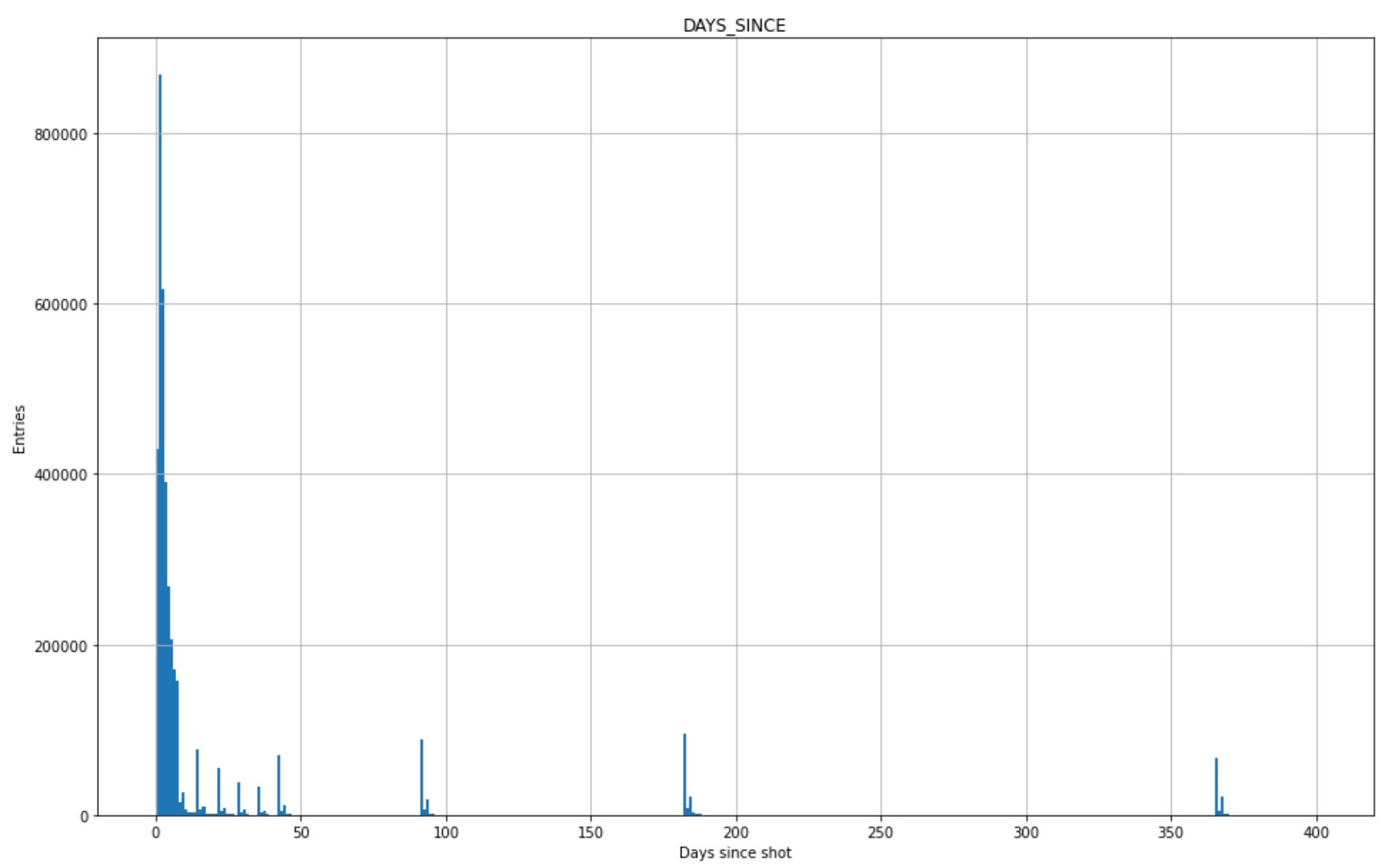
The distribution is discrete, corresponding to the specific times when the instant message prompts are sent out. Those prompts to respond also have a time limit — they time out after a couple days such that late people can’t respond to that round. I can probably see why one might do this, but it introduces another bias away from people not feeling well enough to report right away.
The results of these surveys were squirreled away, never to be seen, until they were brought to light by ICAN’s FOIA’s. The data revealed came in the form of 5 csv files, for approximately 10 million registrants:
Most are aggregated summary tables, one with some truncated zip code location information, one looks to be for the benefit of potential eugenicists, another with a list of doses and brands…
Each registrant is identified by a unique string to preserve anonymity, and the identifier strings appear where relevant in each of the csv files to allow joining that data together. Not unlike the VAERS_ID in the VAERS csv files.
One important piece of information appears to be missing: Ages. We maybe only know if the user is older than 3 through naming of some of the reporting categories. I suppose one might guess this anyway though, given respondents are required to READ AND ANSWER QUESTIONS ON A WEB PAGE. One thing on my list to check is if one can infer one relevant age group by existence of a reference in a guardian field. But otherwise, that one is a pretty big miss. There is a location field by the first 3 digits of a zip code. I hope that can be mapped well to state boundaries7. Probably.
The primary file of interest to me here is that 23 gigabyte “consolidated_health_checkin.csv”. This is the time streamed data resulting from all of these regular prompts. It’s essentially the meat of the thing, covering the responses from approximately 10 million users. Its a 145 million line csv file full of response categories and timestamps. I expect trying to load that thing into excel would result in a steaming turd plopped on your desk. Which actually seems appropriate given the man responsible for that piece of s… oftware.
Given the size of the thing, I’ve so far been playing with a 10% prescale8 sampling of it to understand what it says, and work out how make it more digestable next iteration. The plots you see here today will be 10x less populated than you might expect from the full dataset. I’m still fiddling with size reduction of this thing — there’s a lot of room for improvement. Many of the fields are fixed text values that can be parsed and distilled. I understand why these were distributed as csv files, but these string based globs really are a fantastically stupid way of packaging mostly True/False and numerical data.
OK. Enough. Lets see what we have here — first thing is to look at the entry time — when data was received:
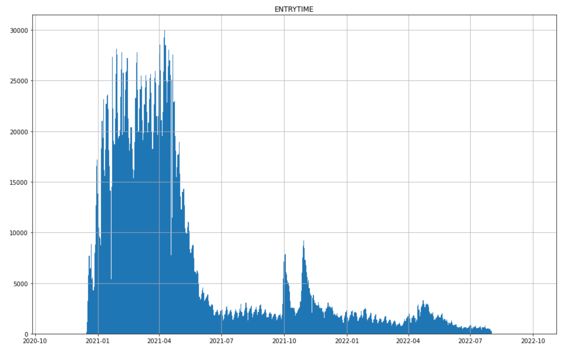
So this is interesting — the large emphasis early on makes sense, because thats when most of the shots were given. The peaks in Fall 2021, and Spring 2022 I suspect are boosters. Let’s see if we can pull that out. There is information encoded in a SURVEY_STATIC_ID column that identifies which dose and IM prompt the data belongs to. I can use that and the DAYS_SINCE column we plotted above to try to identify the first entry per user for each dose:
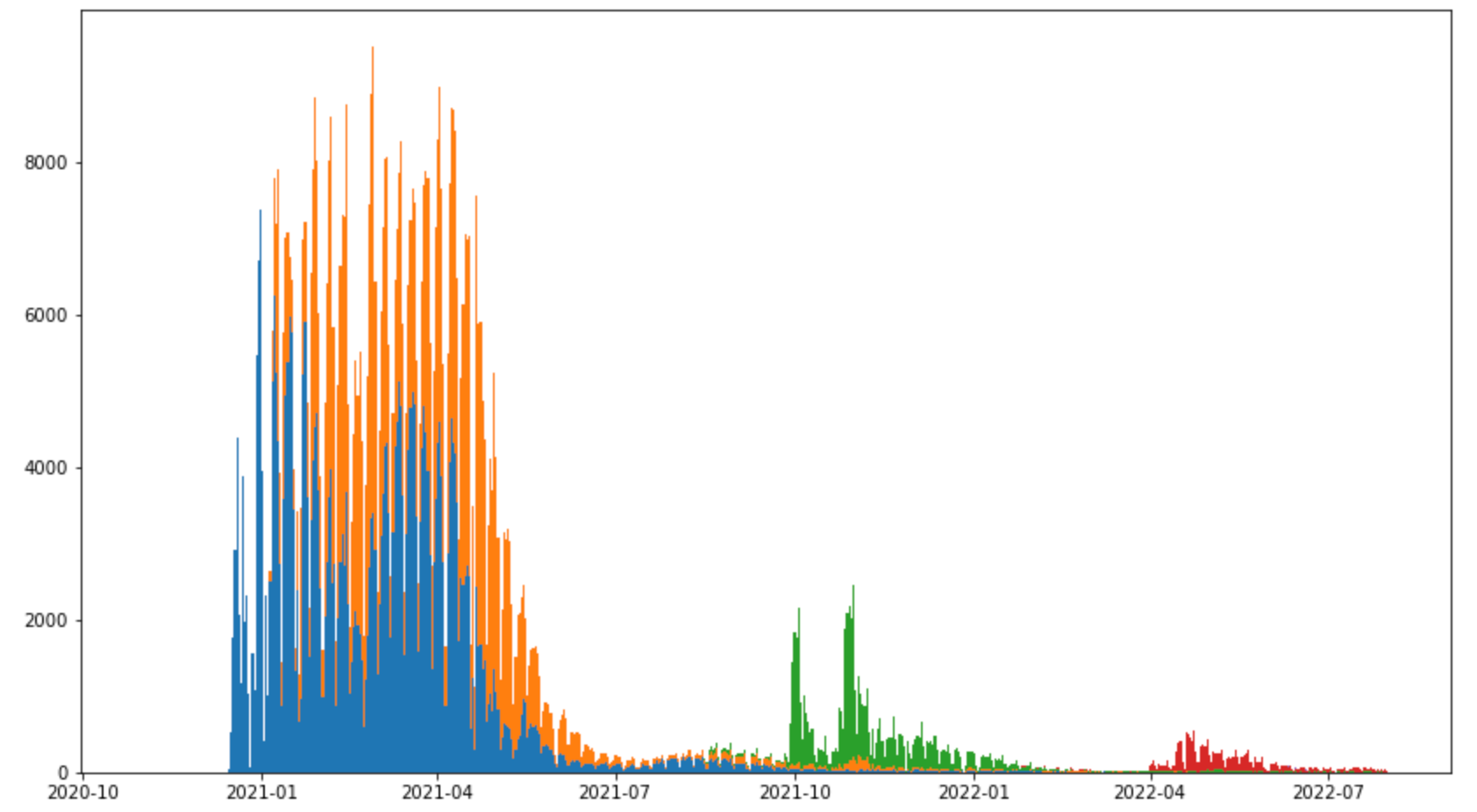
And there we go - first blob from the initial rush for shots in blue and orange, then first round of boosters in green (two rushes there — I expect corrsponding to age based eligibility9 ), and second round of boosters in red.
There is another interesting column that I think I want to spend some more time on: TESTED_POSITIVE_DATE. I believe this is the most recent time each user tested positive for covid. This I think could have some utility in comparing to other sources of breakthrough infection data. The time distribution of these is this:

Compare to this10:
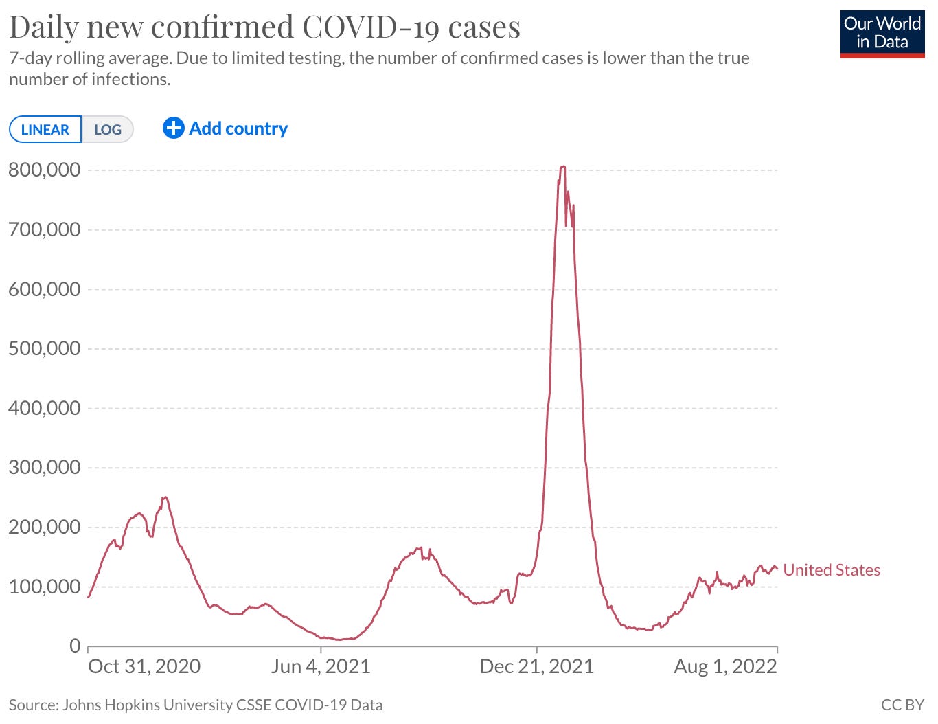
Many similar features, but also work yet to do to compare these right. Age distributions are unknown in the V-safe data we have, and likely different from the population as a whole. There may be some things we can do breaking out reports by state and/or comparing to CDC and state breakthrough numbers. I have also not checked yet how many of these are multiply counted in V-safe (as in positive tests reported multiple times for a user).
Being able to do interesting things like comparing these to VAERS will be tricky though without also having more from V-safe (i.e. user ages). In principle the CDC has the actual ID’s of the individuals these reports originated from, and could attach or merge in references to external case/hospitalization/fatality data or VAERS reports. They could use the existing unique ID’s in this data present the combination and still maintain user anonymity. Hopefully there are additional FOIA’s incoming. Or outgoing. In motion.
As it is, we might be able to learn something about breakthrough cases with this, to the extent positive tests are representative of anything meaningful. Its also fairly disappointing, given the claims regarding how advanced and well tracked this data is. What we really seem to see is results from a canned set of queries tuned for an expectation of arm rashes and mild headaches. It is important to also remember that a self reporting system like this by definition has no way to identify the most serious debilitating adverse effects. Without being able to tie this to other external data sources, we cannot make any true determination of the dangers that come with the covid shots. Of course there is obvious motivation for a captured agent of the pharmaceutical industry to not be able to see the worst effects of its products.
But we will poke at it some more and see what we can pull out.
https://www.icandecide.org/v-safe/
https://www.icandecide.org/
https://www.cdc.gov/coronavirus/2019-ncov/vaccines/safety/vsafe.html
Will see if this works: —could be strange (actually seems the embed looks better if I type a whole line of random text.) There:
TBH, I thought this was more FDA territory. Not sure how lines are drawn these days…
Its interesting you can find complaints of this lighting off alerts at odd hours of the night…. All sorts of governmental quality fun.
Possibly: https://en.wikipedia.org/wiki/List_of_ZIP_Code_prefixes
every 10th line
AHA — another identifiable age group maybe…
https://ourworldindata.org/coronavirus/country/united-states
“But there could still be undigested kernels in the...”
😂😂😂
Did you see the Highwire dashboard for this info?