

Bond ETF Q&A
Bond ETF Q&A
Two common fixed income ETF questions answered

Over the past week, I’ve received myriad questions regarding the iShares 20+ Year Treasury Bond BuyWrite Strategy ETF (NSDQ: TLTW), which I’ve recommended for some time now in the model portfolio in the paid tier of Free Market Speculator.
Some questions are specific to TLTW; others have significant, broader implications for all bond exchange-traded funds (ETFs).
It’s clear the return of significant, positive yields on fixed income instruments over the past two years means ETFs tracking bond markets, and fixed income strategies, are becoming more popular, and more widely owned, by individual investors.
I won’t print the specific questions I’ve received here in this forum. Instead, since most questions fit into two broad categories, I’ve created generic questions to address each of these two main points.
If you’d like to ask me a question, you can always drop a comment in the comment section below or send me an email at freemarketspeculator@substack.com. I’ll try to address some of the questions I receive in a future Q&A issue and, of course, I am always happy to keep the questions posed anonymous.
Question: The iShares 20+ Year Treasury Bond BuyWrite Strategy ETF (NSDQ: TLTW) is in a steady downtrend and has been trading at new 52-week lows in recent days. Why is TLTW so weak when bond yields have been falling in recent weeks?
Aren’t falling Treasury yields bullish for Treasury bond prices?
Answer: When I’m evaluating a stock or exchange-traded fund (ETF), the first thing I do, whether I’m familiar with the company and industry or it’s entirely a new name, is pull up a chart. Usually, I look at both a daily chart of the stock over the past 12 months and a weekly chart that covers trading action over the past 5 years.
I never add a stock, ETF or commodity to the model portfolio solely based on technical and chart analysis, but I find a glance at the charts quickly communicates volumes about how the market perceives an investment. Charts have also saved me from making some serious mistakes over the years, helping convince me to bail out of a trade or recommendation before I could see any deterioration in fundamentals, or avoid a stock altogether.
So, I use charts, and technical analysis, all the time and I consider it an important tool in my kit. However, charts can also be misleading, and that’s particularly true for bond ETFs like TLTW.
That’s because distributions paid by bond ETFs -- many monthly -- are often the most important source of your returns from the fund over time. And, since distributions aren’t reflected in a simple price chart, looking at charts will give you a warped sense of how the ETF is performing.
The strategy behind TLTW is pretty straightforward. The ETF owns units of the iShares 20+ Year Treasury Bond ETF (NYSE: TLT) and sells call options – known as covered calls – against its position in TLT. As the name implies, TLT is a fund that tracks longer term US government bonds – Treasuries with 20 or more years until maturity.
Let me explain how a covered call trade works in brief.
A call option gives the holder the right, but not the obligation, to buy the underlying asset – in this case the TLT fund – at a predetermined strike price on or before expiration of that option.
Right now, the TLTW fund holds units of TLT and is short (the fund has written) contracts of the February 2024 TLT $97 call options, which are due to expire on Friday February 16, 2024.
When TLTW sold those call options, the ETF received a premium payment on the calls. However, by selling the calls it also opens an obligation, because the buyer/owner of the calls can choose to exercise them at any time between now and February 16th. If the calls are exercised, then the TLTW ETF would have to sell units of TLT to the owner of the calls at a price of $97 per unit.
Of course, if TLT is trading below $97, there’s no incentive to exercise the calls – after all, why would you exercise the option to buy TLT at $97 if you can buy it on the open market at a price of $94.65 (the closing price on Monday Jan. 22nd)?
However, let’s say TLT does rally and is trading at $98 on February 16th. In this case, the call buyer probably would exercise their option to buy TLT at $97.
(The calls would have an intrinsic value of $1 if TLT closes at $98 on February 16th because you could exercise the option to buy TLT at $97, then turn around and sell it on the open market at $98, realizing $1 in profit.)
In this case, the calls TLTW has sold are “covered” because the ETF owns units of TLT. So, when the calls are exercised, the ETF simply sells the owner of the calls units of TLT it owns at the strike price of $97. Importantly, under any circumstance, TLTW gets to keep the premium received from selling the calls.
Also, since TLTW owns actual units of TLT, it will receive the monthly distributions of the TLT fund just like any other unitholder (unitholder is the equivalent of shareholder for an ETF).
So, the monthly distributions you receive as a TLTW unitholder represent both some of the premium earned from selling call options on TLT (the covered call portion of the strategy) and the distributions paid by the TLT fund. In turn, the TLT distributions represent a pass through of payments made by long-term US government bonds (20+ year Treasuries) held in the TLT fund.
The effect of all this is TLTW has offered a (very) high yield to unitholders. Over the past 12 months, for example, TLTW has paid a total of $5.38165 per unit in dividends, which compares to a current unit price of around $26.43 at the time of this writing, for a trailing yield of roughly 20.4%.
The crucial point to note is that these monthly distributions are NOT factored into the price chart of TLTW over time.
So, consider the rollercoaster ride we’ve seen in Treasury yields since last October:
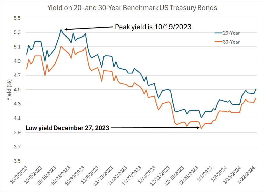
Source: Bloomberg
This chart shows the yield on 20- and 30-Year Treasuries since last October. As you can see, the peak for Treasury yields was around October 19th at 5.342% for the 20-year and 5.112% for the 30-year. Recall this was back at a time when the consensus on Wall Street was chattering about an economic boom and the need for higher-for-longer interest rates.
Bonds yields fell – bond prices rallied – from October 19th until late December. Specifically on December 27th, the yields on the 20- and 30-Year Treasuries bottomed at 4.106% and 3.954% respectively. This marked a time when the crowd narrative had shifted in favor of a March pivot on rates and a rapid pace of Fed easing through 2024.
Finally, since late December, yields have jumped once again (Treasury prices have fallen) though we’re still a long way from the October 19th peak levels, meaning that while bond prices are off their highs, they’re still up compared to where they were on October 19th.
So, let’s look at a simple price chart for TLTW since October 19th:
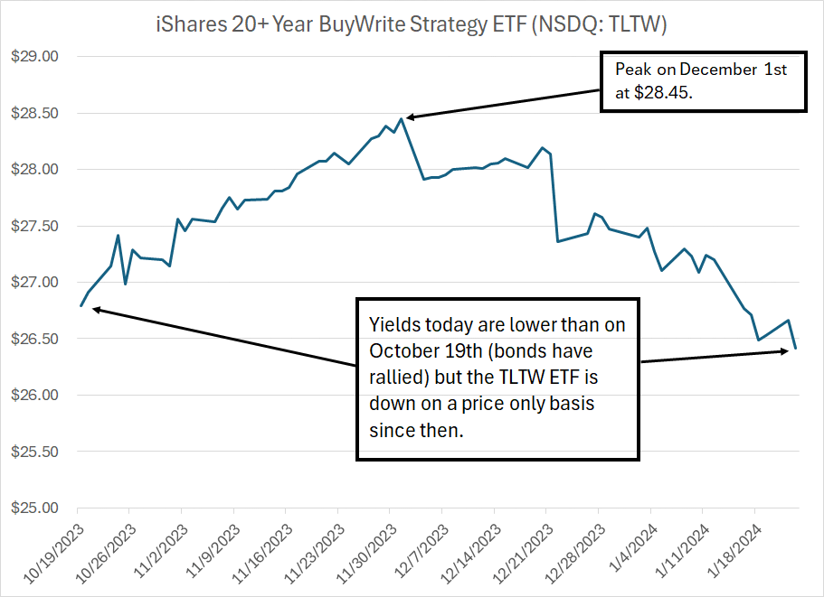
Source: Bloomberg
Since TLTW generally tracks the performance of Treasury bonds with 20 or more years until maturity, you’d expect the ETF to rally when bond yields are falling and to sell off when yields are rising.
At first blush this chart looks terrible. After all, while bond yields declined from October 19th until December 27th, TLTW reached a peak on December 1st and then declined through the end of that month. Also, the price of TLTW today is lower than it was on October 19th despite the fact 20-year and 30-Year Treasuries have both rallied (yields lower) over the intervening time frame.
However, again, the price chart I just showed you – the chart you see when you look at a 6- or 12-month chart of TLTW – does NOT include the benefit received from TLTW’s distributions over time.
In this case, TLTW went ex-distribution on a $0.400447 distribution on November 3rd, $0.576856 on December 4th and an additional $0.746033 on December 22nd for a total of more than $1.72 in distributions since October 19th. This is very real cash in hand that is not reflected in the price chart I just showed you.
So, let’s look at a chart of total returns – price change and distributions – from October 19th until January 22nd:
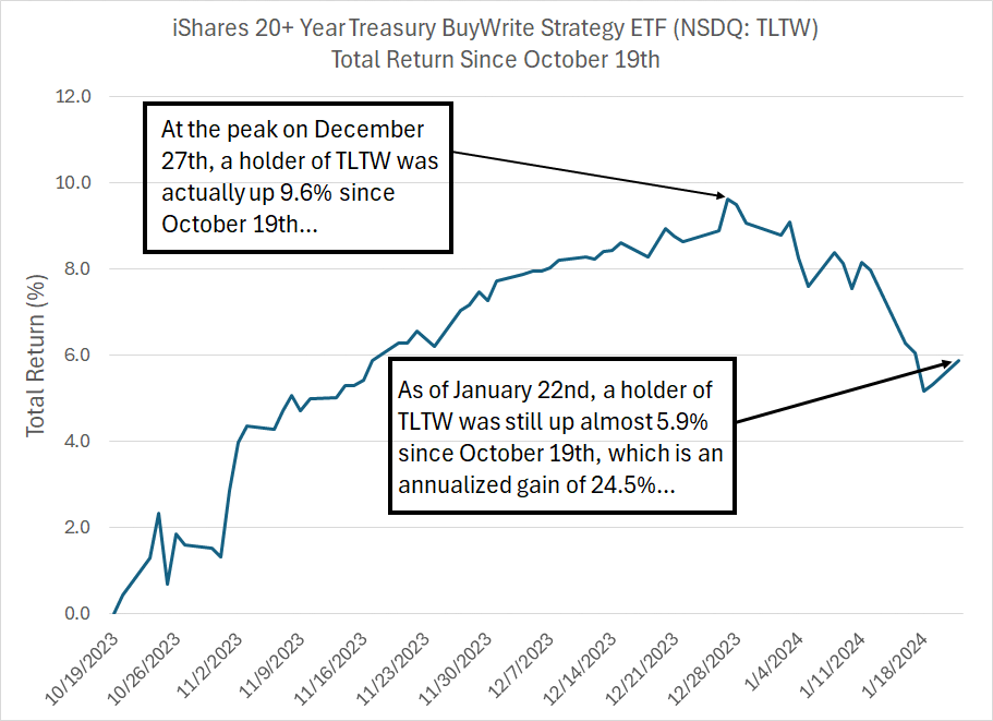
Source: Bloomberg
This chart shows a totally different picture.
As you can see, if you’d bought TLTW at the closing price on October 19th (the closing low for 20-year and 30-year Treasuries) your maximum gain as of the close on December 27th was about 9.6%. That matches up well with the recent low for yields on the same date that I highlighted earlier.
As of Monday January 22nd, TLTW was still up about 5.9% from the close on October 19th, NOT near a 52-week low as a simple price chart would suggest. And while 5.9% over about a 3-month holding period might not seem like a huge gain, it annualizes to more than 24.5%.
That’s not exactly what you might hope for from a well-timed trade in a stock like NVIDIA (NSDQ: NVDA); however, it’s more than respectable for an ETF that ultimately tracks US government bonds.
This point is also important: I still look at charts when it comes to bond ETFs like TLTW.
It’s just that you need to adjust those charts to reflect the distributions paid, or the chart is close to meaningless.
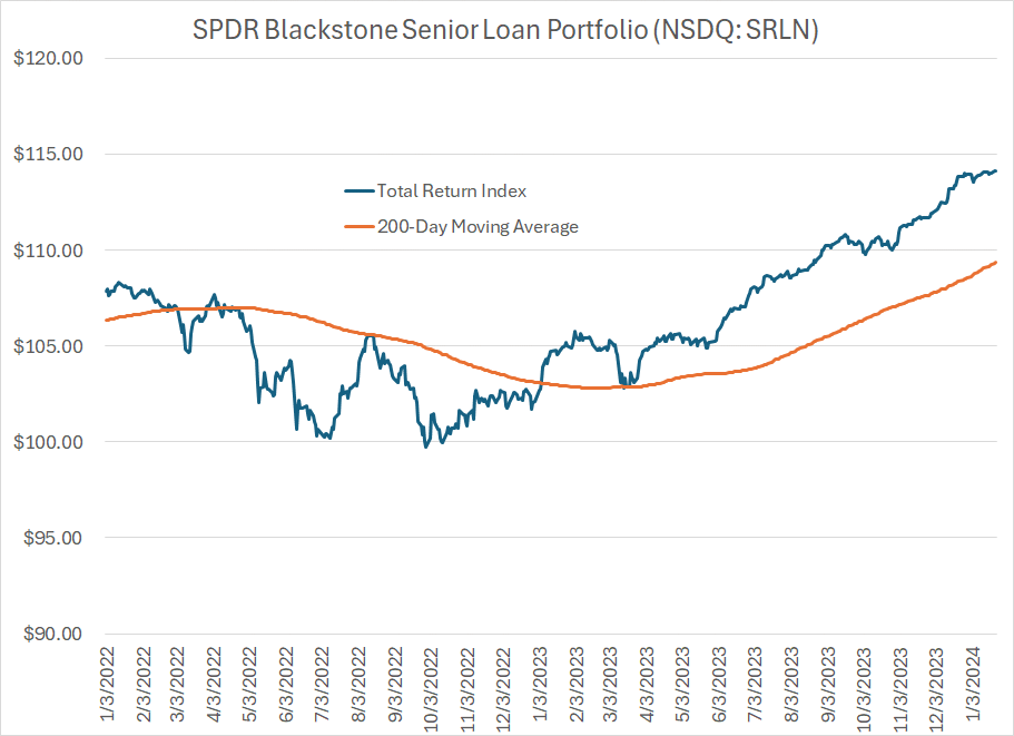
Let me illustrate with a chart of a different ETF, the Blackstone Senior Loan Portfolio (NSDQ: SRLN), which I recommended in the FMS model portfolio for a time in 2022-23 though it’s not currently in the model. SRLN buys a portfolio of bank loans – these are loans made to companies that carry a floating rate, usually some spread over a benchmark like the Secured Overnight Financing Rate (SOFR).
First up, here’s the price chart:
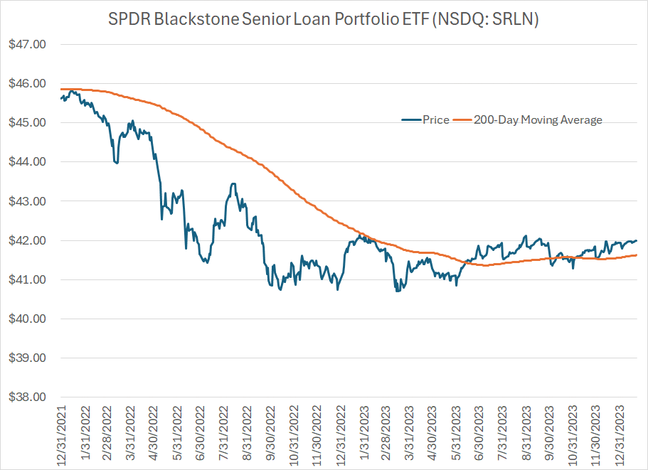
Source: Bloomberg
This is the closing price of SRLN starting at the end of 2021 through to the present. I’ve also overlaid the 200-day moving average of the closing price as an orange line; for those unfamiliar, the 200-day moving average is a good longer-term trend indicator for stocks and indices.
As you can see here, the chart of SRLN looks terrible – basically a downtrend through 2022 followed by a flatline over the past 12+ months. At first blush, SRLN is not very interesting as an investment opportunity in that regard.
(If this were a potential stock recommendation, I would probably pass on it unless it showed signs of breaking above long-term resistance there a little over $42.)
However, I’ve created a total return index for SRLN with a starting value of 100 on December 31, 2019 – this index incorporates both the price change in the ETF and the distributions paid every month. Here’s what that chart looks like over the same time frame as in the chart just above:
Source: Bloomberg
This chart looks different to say the least.
After all, SRLN was weak in the first half of 2022; however, the downside was small in percentage terms. Specifically, on a price-only basis, SRLN declined by over 10% in calendar year 2022, but on a total return basis the ETF was down just 5.3%. To put that loss in context, 2022 was arguably the worst year for fixed income in four decades, and the S&P 500 was down more than 18%, so 5.3% isn’t a terrible showing.
Even more important, look at my total return chart above and you’ll see SRLN clearly broke out above its 200-day moving average in January 2023. While the price of SRLN has flatlined for the past year, the ETF has produced strong total returns and is up 11.8% since the end of 2022 alone. The total return chart shows a strong uptrend for much of the past 12+ months.
That’s a direct result of the fact SRLN pays monthly distributions and, over the past year, distributions have accounted for some 8.5% of returns with a bit more of a return “kicker” if you’d reinvested those distributions into the ETF.
While the price of SRLN has been flat, investors have generated a solid return mainly through the ETF’s 9.4% yield, with low volatility relative to the stock market.
The bottom line is that what investors buying fixed income ETFs really care about is total returns – distributions AND capital gains – not capital gains (price changes) in isolation.
In the stock market capital gains are often the most important piece of your returns. Granted, there are important exceptions such as some income-oriented groups like utilities, select energy names, Real Estate Investment Trusts (REITs) and Master Limited Partnerships (MLPs).
However, in the fixed income ETF world, the exact opposite is often true -- it’s often the accumulation of distributions over time that accounts for the bulk of investor returns – you just can’t ignore income and hope to perform well in an asset class known as “fixed income.”
That’s why I’ve created total return indices for all of the fixed income ETFs I cover in FMS and those are the charts I follow, not simple price charts offered by most brokers or on financial websites.
Question: How risky is the iShares 20+ Year Treasury Bond BuyWrite Strategy ETF (NSDQ: TLTW) and is the distribution safe?
That’s a more complex question than it might first appear.
The underlying asset in the TLTW exchange traded fund (ETF) is the iShares 20+ Year Treasury ETF (NYSE: TLT) which owns a portfolio of longer-term US Treasury Bonds. US Treasuries are generally considered to have no credit risk, because the US government borrows in dollars and, rather conveniently, the US Federal Reserve can also create dollars.
Theoretically, the US government could “print” money and pay back all its debts though, obviously, that would create significant, potentially cataclysmic, global economic repercussions.
Of course, there remains interest rate risk.
Let’s consider one of the top holdings in in the TLT portfolio as an example: The US Treasury 1 7/8% bonds that mature on February 15, 2051. These bonds were first issued on February 16, 2021 when this was a 30-Year US Treasury bond; today, these bonds only have about 27 years remaining until maturity.
Of course, prevailing interest rates in the US were much lower 3 years ago in early 2021 than is the case today. In mid-February 2021, the Federal Reserve had the Fed Funds rate pegged near zero (a target of 0% to 0.25%) and was still buying US Treasuries and mortgage-backed securities (MBS) outright to push down longer-term interest rates.
The coupon rate on this bond was 1 7/8% (1.875%), which means that the bond pays 1.875% of its face or par value on a semi-annual basis. So, if you bought that issue in mid-February 2021 with a face value of $1,000 you’d receive $18.75 over the course of a year in coupon repayments (in two installments) plus the $1,000 at the time the bond matures in 2051.
Today, the prevailing yield on 30-year US Government Bonds is much higher at just under 4.4%; however, it’s not the coupon rate that changes on bonds (hence the term fixed income) and those 1 7/8% bonds of 2051 issued back in 2021 still pay $18.75 a year in two installments. What’s changed is the price – the 1 7/8% Bonds of February 2015 currently sell for a little over 59% of par value, which means that a bond with face value of $1,000 would cost about $590 on the open market today.
So, you still receive the entire $18.75 in annual coupon payments and the full $1,000 in principal repayment at maturity in 2051; however, the trading price of the bond in the open market is lower, so your yield if you bought the bond today is higher.
Simply put, if interest rates rise, the price of Treasury bonds will generally fall as has been the case since 2021. In addition, the longer the maturity of the bond, the more sensitive the price is to interest rates – so the price of a 30-year bond will fall more than a 10-year bond if prevailing rates rise.
This, in a nutshell, explains why 2022 was such a terrible year for fixed income – the Federal Reserve undertook one of the most aggressive monetary tightening campaigns in its history.
Take a look:
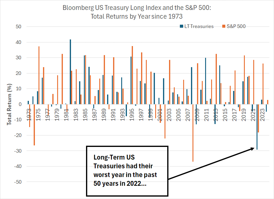
Source: Bloomberg
This chart shows the total return from the Bloomberg US Long-Term Treasury Index (blue bars) and the S&P 500 (orange bars) for each year since 1973. This index tracks total return (NOT just price) from a portfolio of US Treasury Bonds with 10 or more years remaining until maturity.
To say 2022 was unusual would be the understatement of the century.
(Well, technically, the half-century I suppose).
Not only did long-term US Treasuries see their worst return since at least 1973, down almost 30%, but both the stock market and the bond market were down simultaneously. To make matters even worse, long-term bonds underperformed the S&P 500 by a significant margin.
Certainly, Treasuries did not fulfill their traditional role as a haven during stock market storms. Look at years like 2008 and 2000-02 and you’ll see bonds rallied as stocks got hit hard, offering a useful ballast for a balanced portfolio. That was not the case in 2022.
So, something was clearly broken in markets in 2022. In my view, the economic, stock and bond market volatility of the past 4 years should serve as an indicator that policy volatility – moving from extreme easy money stimulus to slamming the brakes through the footwell in the space of 18 months – probably doesn’t represent best practices for central banks.
(Indeed, much the same could be said of throwing trillions of dollars in fiscal stimulus at the economy at a time when the economy is growing.)
However, I digress. The above chart should tell you three things.
First, 2022 was a very unusual year in market history.
Second, generally, the returns from long-term Treasury bonds are less volatile than for the S&P 500. Specifically, if you calculate the standard deviation of annual returns from the Bloomberg Long-Term Treasury Index since 1973 it’s 12.94% compared to 17.62% for the S&P 500 over the exact same holding period.
Third, even though Treasuries have no credit risk does NOT mean they’re riskless – when prevailing interest rates rise, the price of Treasury bonds will fall and the bond market has good years and bad years. It’s just that usually, the swings in performance from year-to-year are less than for the S&P 500.
Also note that different types of fixed income investment, and different fixed income ETFs, can produce very different returns in any given year. For example, the iShares 20+ Year Treasury ETF (NYSE: TLT) is down 9.42% over the past year; in contrast, the SPDR Blackstone Senior Loan ETF I mentioned earlier is up 8.6% and the SPDR Bloomberg 1-3 Month Treasury Bill ETF (NYSE: BIL) is up 5.1%. So, as with the stock market, selectivity is key to long-term returns with a portfolio of bond ETFs, and the good news is the proliferation of fixed income ETFs tracking various parts of the bond market give investors more choice than ever before.
And that brings me back to TLTW.
Since the underlying asset in TLTW is TLT, the ETF will be exposed to the same interest rate risks as the long-term US Treasury Bond market.
However, the addition to TLTW is the covered call overlay strategy – as I mentioned earlier, the TLTW ETF sells covered call options to generate additional income each month. The important point to note is that this will tend to dampen volatility somewhat over time.
Generally, there are three possible scenarios when an investor sells covered calls.
Scenario #1: The underlying asset (in this case TLT) rises significantly and closes above the strike price at expiration. In this case, the seller of the covered call is essentially giving up any capital gains from owning TLT above the strike price.
So, in strong rallies I’d expect TLTW to underperform TLT.
Scenario #2: TLT trades sideways and remains under the strike price at expiration. In this case, TLTW is likely to outperform TLT because of the extra income derived by selling the calls.
Scenario #3: TLT sells off significantly. In this case, both TLT and TLTW will likely lose money, but TLTW would tend to outperform because the covered calls provide an extra return cushion for investors.
Here’s one way to look at it based on recent market history.
Between the beginning of 2023 and the end of July 2023, the TLT ETF traded roughly sideways on a price only basis. The total return from holding TLT over the first 7 months of last year was 2.06% while TLTW was up 8.94%. So, TLTW outperformed TLT in a flat environment for long-term Treasuries just as we’d expect.
Then, from the end of August to October 19, 2023, TLT sold off, offering a total return of -13.4%. TLTW also got hit, though the covered call strategy overlay softened the blow and the total return for TLTW in the bond bloodbath of late-summer and early autumn was about 11.4%, 2 percentage points of outperformance.
TLTW has also outperformed amid the bond selloff since December 27th – TLT is down almost 7% since that time compared to a 4.4% decline for TLTW, a difference of about 2.6 percentage points over less than a month.
In contrast, during strong bond market rallies, such as from October 19th to December 27th of last year, TLTW will limit your upside relative to TLT. Over this period, TLTW was up about 10% while TLT was up more than 22%.
So, generally, TLTW shows less volatility than TLT, and will outperform in flat or down markets while underperforming especially amid strong bond market rallies.
Currently, I prefer TLTW to TLT. The reason is that I believe yields are pretty close to fair value for longer-term Treasuries at this time and I see yields roughly rangebound over the next few months. In such an environment, TLTW should outperform for the reasons I outlined.
Ultimately, I do not believe it’s different this time – while extreme monetary and fiscal stimulus in 2020-2021 have clearly delayed the recession, I remain of the view hard landing is likely. And as a recession comes into view I do believe we could see a more durable bond market rally; in such an environment I may well prefer TLT.
Lastly, the monthly distributions for both TLT and TLTW and questions regarding if they’re safe.
The answer depends on what you mean by safe.
For TLT, the underlying coupon payments are safe because these are Treasury bonds. However, monthly distributions are not stable – they will bounce around from month to month due to factors such as the timing of interest payments made on the portfolio.
In TLTW’s case, the covered call strategy also leads to more variation in month to month payouts.
Specifically, TLTW’s distributions have varied over the past year from as little at $0.196739 in August 2023 to as much as $0.746033 at the end of last year. However, over time I do expect TLTW to offer an impressive yield.
And it’s important to remember the covered call strategy never adds to your downside risk even though it can limit your upside. In other words, if bonds and the TLT sell-off, the covered call overlay will always reduce your losses by at least a small amount.
I covered a lot of ground in this lengthy post today. I did so because I believe we’re entering an economic and interest rate environment – read positive yields – where fixed income strategies will become a far more profitable and popular investment option for individual investors.
That’s why I’m working on a more comprehensive bond market report to be released in the next few weeks as part of a subscription to the paid tier to Free Market Speculator. It’s also why I’ve been writing about the bond market and bond ETFs so much here over the past year, and will continue to do so in 2024.
DISCLAIMER: This article is not investment advice and represents the opinions of its author, Elliott Gue. The Free Market Speculator is NOT a securities broker/dealer or an investment advisor. You are responsible for your own investment decisions. All information contained in our newsletters and posts should be independently verified with the companies mentioned, and readers should always conduct their own research and due diligence and consider obtaining professional advice before making any investment decision.