

Growth and Inflation Resurgent
Growth and Inflation Resurgent
Plus: Gold, Gold Mining Stocks, Oil and the Dollar

Last week’s ISM Manufacturing Purchasing Manager’s Index (PMI) looked weak at first glance.
Economists expected the headline number to rise slightly from 49.1 in January to 49.5 in February, just below the key 50 level that divides economic contraction from expansion; instead, the headline dropped back to 47.8.
However, I’m not convinced ISM was as weak as it looked:
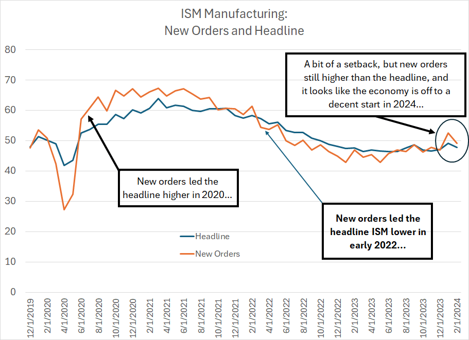
Source: Bloomberg
This chart shows the ISM Manufacturing headline index in blue and the New Orders Index in orange.
As you can see, new orders tend to lead the headline. In the spring and summer of 2020, for example, ISM New Orders surged to levels well over 60, leading a more gradual rise in the headline.
Then in 2022, ISM New Orders crossed below the headline PMI early in the year and to that key 50 level by June 2022. This led a more serious deceleration in US economic growth, and the headline ISM Manufacturing Index, later in the same year.
Now, look at the chart over the past two months. In January, the new orders component surged to 52.5, the first reading over 50 since the summer of 2022, suggesting the headline index might move back over 50 again in Q1 2024, amid a reacceleration in US economic growth.
That hasn’t happened yet, and ISM New Orders slipped back below 50 in February. However, it’s worth noting that the ISM New Orders Index tends to see more month-to-month volatility and is prone to some aberrant readings; more important, the broader trend of ISM New Orders above the headline index remains intact for now.
This sanguine interpretation is supported by an additional transformation of the ISM data I’ve written about a few times over the past few years:
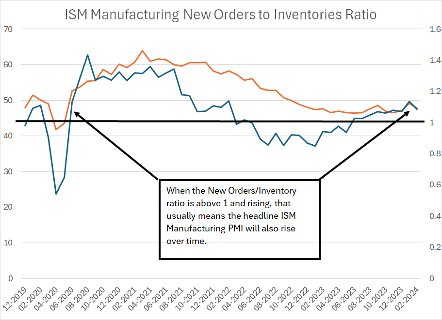
Source: Bloomberg
The dark blue line on my chart is the ratio of two indices that are part of the ISM Manufacturing release, the ISM New Orders Index divided by the ISM Inventories Index. When this ratio is rising, and above a level of 1, it tends to lead the headline ISM Manufacturing PMI Index (pictured in orange above) higher over time.
Here's the logic.
ISM New Orders tracks the incoming pace of orders for US manufacturers – levels above 50 indicate a rising pace of incoming orders. The ISM inventories figure shows the accumulation or dissipation of manufacturers’ inventories – readings below 50 indicate inventory destocking.
So, consider a situation where manufacturers are reducing their inventories – a low ISM Inventory Index – and the incoming pace of new orders picks up, a rising ISM New Orders Index. That’s a positive development because it means manufacturers are running lean inventories and seeing an increase in demand – that means they’re likely to want to increase production both to meet incoming demand and stabilize or rebuild their inventories.
So, readings over 1 suggest a likely increase in production – the headline PMI – over time.
This is exactly the current situation, and it suggests the ISM Manufacturing PMI is headed back over 50 in the next few months. This is not exactly a sign the US economy is booming; yet it does suggest economic conditions remain stable as we move through Q1 2024.
Sector, Country and Style Trends
In recent weeks I’ve written about market breadth, including breadth in various sectors of the S&P 500.
Relative sector and market trends are consistent with this sanguine interpretation of the economic data.
Consider the small caps:
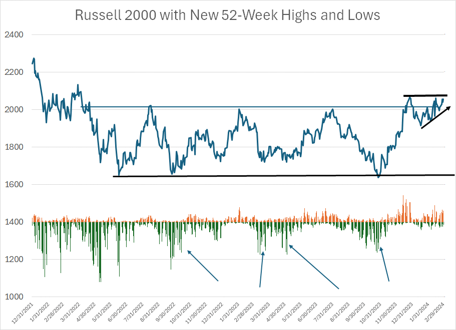
Source: Bloomberg
The dark blue line represents the closing level for the Russell 2000 Index since the end of 2021. The bars below the chart show the percentage of Russell 2000 stocks making new 52-week highs (orange bars) compared to the percentage of stocks making new 52-week lows (negative green bars).
As you can see, the Russell is near the top of a trading range that’s been in place since the spring/summer of 2022, nearly two years ago now. What’s interesting is that ever since early 2022, the percentage of small-cap Russell 2000 stocks making new lows expanded dramatically when the Russell sold off toward the bottom of its trading range (I’ve labeled these with arrows).
In contrast, when the Russell rallied to retest the top of its trading range, the number of stocks rallying to new 52-week highs remained low, a sign rallies were not supported by powerful uptrends in most stocks.
That started to change late last year – the Russell 2000 broke above the top of its trading range in late December and the percentage of stocks making new 52-week highs soared to over 14%, the highest reading since 2021.
This year, once again, the Russell 2000 has pulled back and there were legitimate concerns the late 2023 break higher for the Russell was yet another false dawn for the small caps. However, note that on the pullback this year we just haven’t seen any meaningful expansion in the number of Russell stocks breaking down to new 52-week lows.
In other words, the pullback this year has been less powerful than the rollovers we saw from that same resistance level throughout 2022 and 2023. And last month, despite all the talk of Nvidia (NSDQ: NVDA), technology stocks and the Nasdaq, the Russell 2000 was actually the best-performing major index, rising 5.65% compared to 5.41% for the Nasdaq 100 and 5.34% for the S&P 500.
In order for the Russell 2000 to truly break out, we’d need to see a close above the December 27, 2023 closing high just shy of 2,070. We’re a bit above that level as I write this; however, I’d prefer to see a close significantly higher, perhaps above 2,085/2,090 or so to confirm the breakout is more than just noise.
I’d also like to see further confirmation in the form of a rising new highs list – an expansion in the percentage of Russell 2000 stocks making new 52-week highs to above the levels we saw in late 2023.
There are two implications.
First, given just how long small-caps have underperformed large caps, a turn in the tide could represent a powerful investment theme to say the least. Indeed, the last big turn in the small-cap/large-cap ratio in early 1999 led to more than 14 years of Russell 2000 outperformance.
From the end of March 1999 through September 30, 2013 the Russell 2000 jumped 226.11%, outperforming the S&P 500’s 71.10% gain by a margin of more than 155 percentage points.
The second implication is that small cap stocks tend to have greater sensitivity to economic conditions than large caps and have historically outperformed when inflation is buoyant.
In other words, the performance of the Russell seems to be confirming the sanguine outlook for the US economy and may be sounding a klaxon regarding the risks of resurgent inflation right now.
It’s also tough to ignore the resurgent fortunes of many European markets so far this year:
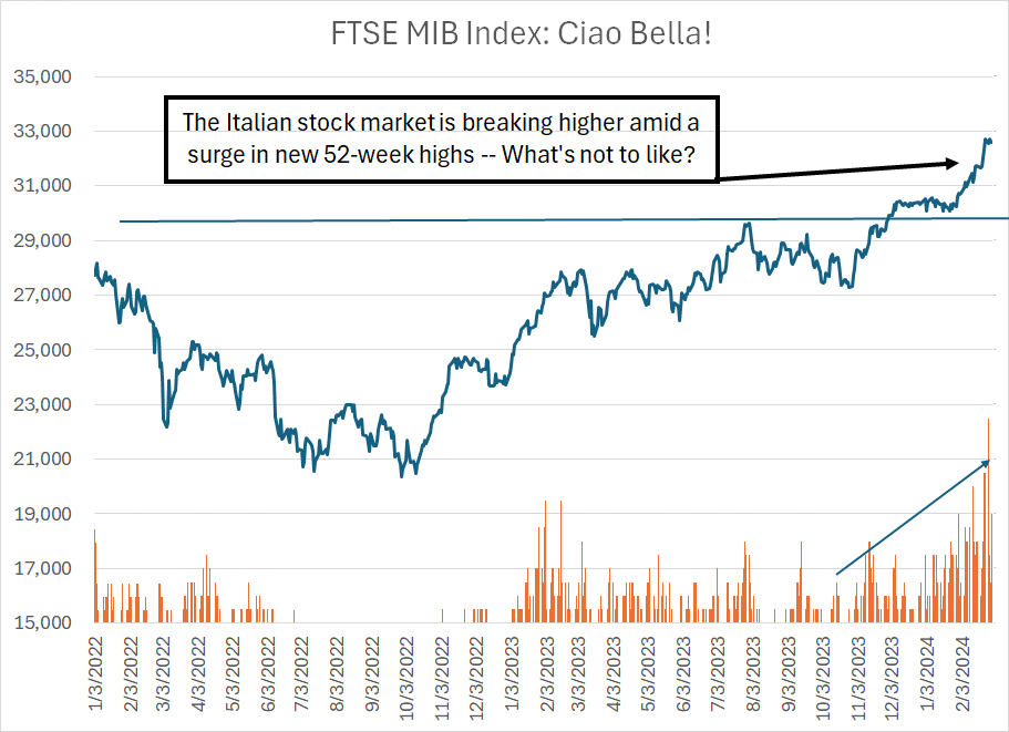
Source: Bloomberg
This chart shows the FTSE MIB Index – an index of the 40 largest stocks on the Italian stock market – since the beginning of 2022. The bars below the chart show the percentage of Italian stocks making new 52-week highs on any given trading day.
As you can see, not only is the Italian market breaking out to new cycle highs, but the percentage of stocks in the index breaking to new highs is reaching levels we haven’t seen in years. And just look at the stocks that dominate the Italian market – more than a quarter of the index is banks, another 20% from automakers including Stellantis and Ferrari. In other words, it’s heavy on economically cyclical components.
And then, of course, there are commodities.
As I write this update gold prices are at new all-time highs over $2,100 per ounce and WTI crude oil appears poised to break back over $80/bbl. I’ll have a bit more to say about both markets, here in a moment
Steel stocks are another group that’s caught my eye of late:
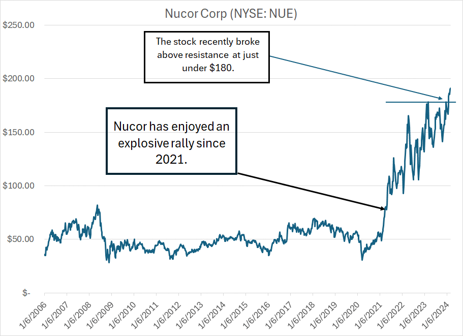
Source: Bloomberg
My point is simple.
Taken together the economic data, and the relative performance of various sectors and stocks, seems to be telling us something – at least for now, global markets are betting on stronger global economic growth and resurgent inflation.
A Quick Word about Gold
I’ve written about gold on a few occasions here in FMS, including the March 30, 2023 issue “The Golden Rules,” where I outlined a simple two-variable regression model I use for tracking gold prices.
In that issue I also wrote that if gold were to close significantly above its 2020 intraday high of $2,075/oz, the yellow metal could jump as high as $3,000 per ounce in short order.
Over the past few days gold has broken out, reaching all-time highs over $2,100 per ounce and resolving a massive base on the weekly chart to the upside:
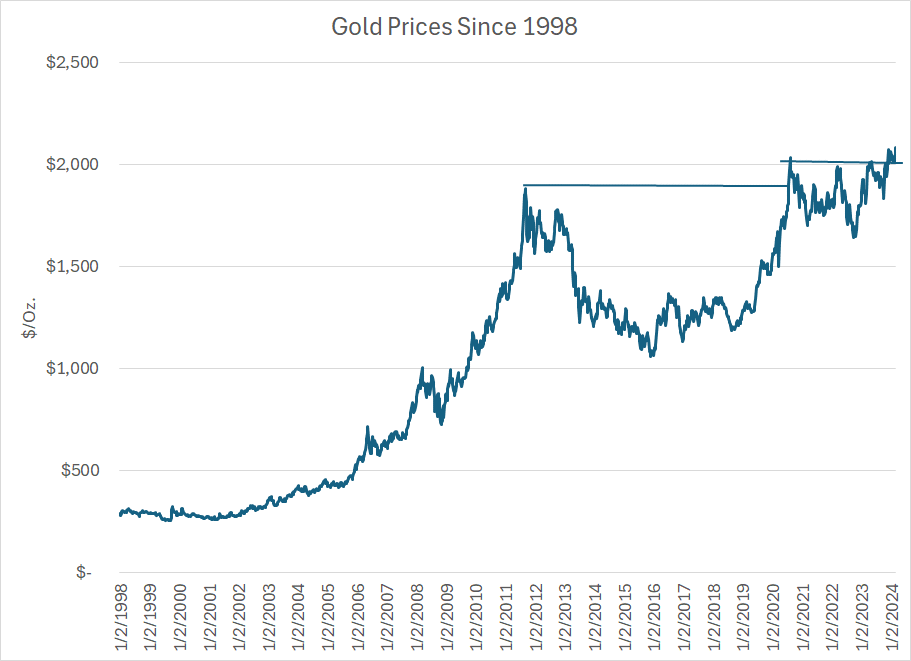
Source: Bloomberg
Gold has been forming what some call a “cup-with-handle” base where the left-hand side of the cup is the 2011 highs for gold. The right-hand side of the cup is the 2020 peak, and the “handle” is the consolidation pattern from 2020 to 2024; in the past few days, gold prices have finally resolved this long base to the upside closing on Wednesday March 6th at an all-time high of $2,148.18/oz.
We started to get a preview of a likely breakout for gold last autumn.
As I said, I track a model of 5-week changes in gold prices that’s based on two variables, the US Dollar Index and the level of real interest rates based on the yield on 5-Year Treasury Inflation-Protected Securities (TIPS).
However, I do not use this model to “predict” future changes in gold prices.
Instead, I look for situations where gold prices are outperforming those two underlying fundamentals — real rates and the US dollar. That was the situation in late October last year.
Back on October 23rd, the US Dollar Index stood at 105.54, up from lows under 100 in mid-July. Meanwhile, The yield on 5-Year Treasury Inflation-Protected Securities (TIPS) were hovering near 2.4%, up from a low of 1.05% back in early April 2023.
In effect, gold prices “should” have been falling, but were not, at least not significantly.
Rather, gold was basing and consolidating just under all-time highs.
Of course, the rally in gold, particularly in the face of what would normally be negative fundamentals, offers further evidence the market is growing increasingly concerned about inflation. Indeed, gold appears to be behaving as it did back in the 1970s when the yellow metal routinely rallied even in the face of a stronger dollar and rising real rates.
In inflationary environments, commodities tend to enter supercycles that are far more persistent than the underlying fundamentals would seem to support.
And that brings me to this:
Gold and Mining Stocks
Last year, in the paid tier of FMS I recommended a few different ways to profit from the bull market in gold.
Of course, one way was to recommend buying an ETF that tracks gold itself, but the second was to buy shares in a prominent gold mining firm and a gold royalty and “streaming” company.
The gold ETF has performed well, tracking the jump in gold prices to fresh all-time highs; however, most gold and precious metals mining stocks have underperformed the metal itself, at least until the past few days:
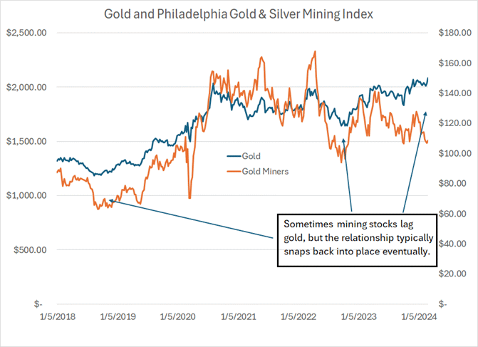
Source: Bloomberg
This chart shows the performance of gold (blue line) and the the Philadelphia Gold and Silver Mining Index (orange line), an index that tracks the performance of about 30 gold and silver mining, royalty and streaming companies.
As you can see, the gold mining stocks have dramatically underperformed gold since the middle of last year, with the Philadelphia Index falling even as gold marched higher.
There are some legitimate fundamental reasons for this. In particular, while gold prices are high and rising, costs associated with producing gold are also on the rise and, in many cases, are rising even faster than the price of gold itself. Some prominent mining stocks have struggled with rising costs and disappointing production trends.
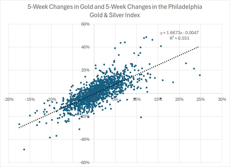
However, over time, the Philadelphia Gold & Silver Mining Index and gold prices are highly correlated:
Source: Bloomberg
This is a scatterplot showing 5-week percentage changes in gold and the Philadelphia Gold and Silver Mining Index since January 23, 1998. The black dotted line is a trendline fitted using the ordinary least squares method, and the equation for that trendline appears at the top right of the chart alongside the R-squared value.
Bottom line: There’s a strong positive correlation here.
When the price of gold rises over a 5-week period, it’s quite likely the price of the Philadelphia Gold & Silver Mining Index will rise as well.
The R-squared value ranges from 0 to 1.0, the former suggests there’s no correlation between two variables, and the latter, perfect correlation. R-squared readings on regressions involving financial markets tend to be low, and a reading of 0.55 is high enough to signal a strong relationship. This suggests that 5-week changes in gold prices “explain” about 55% of contemporaneous 5-week moves in the Philadelphia Gold & Silver Mining Index.
I then transformed this data once again:

Source: Bloomberg
To create this chart I subtracted the 5-week percentage change in the Philly Index from the 5-week change in gold prices. I then created a Z-score based on a 2-year (104 week) lookback period.
Simply put, a reading of +1.5 would indicate gold is outperforming the gold miners by 1.5 standard deviations of the average over the past 104 weeks. The recent high, on the week ended January 19th was 1.53 standard deviations — gold outperformed the miners by around 10.6% percentage points over the trailing 5 week period.
Since 1998, there are 81 weeks where gold outperformed the Philly index by more than 1.5 standard deviations on this basis; on average, the gold miners outperformed gold by just under 4 percentage points over the subsequent 10 weeks.
Simply put, when gold prices outperform the Philadelphia Index by a wide margin over a 5-week period, the miners have a tendency to play “catch-up” in subsequent weeks, outperforming the metal itself.
Oil and the Dollar
One more point.
As I just outlined, the US Dollar Index — an index that tracks the value of the US dollar against a trade-weighted basket of currencies — is a variable in my model for gold prices.
Here’s a scatterplot of 5-week changes in the Dollar Index against contemporaneous 5-week changes in gold:
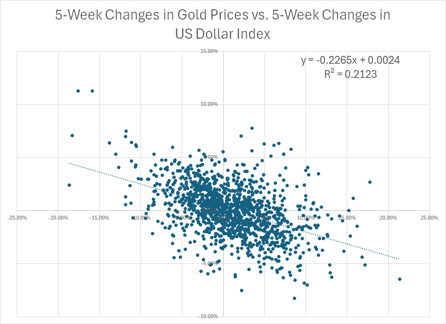
Source: Bloomberg
Pretty clear: A negative correlation, meaning when the US dollar falls, gold prices tend to rise. The R-squared is about 0.2123, so the dollar isn’t the only determinant of short-term changes in gold prices but it’s a meaningful factor.
I am often asked about the importance of the dollar in moving oil prices:
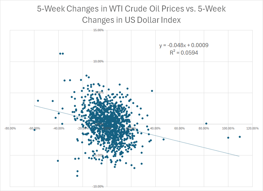
Source: Bloomberg
This is the same regression except I swapped out 5-week changes in gold prices for 5-week changes in front-month West Texas Intermediate (WTI) crude oil prices. As you can see, there’s a negative correlation — a falling dollar is bullish oil — however, the R-squared is less than 0.06, too low to be of any use whatsoever in forecasting likely moves in oil.
Of course, this doesn’t stop the talking heads on financial television from attributing short-term moves in crude to moves in the value of the dollar compared to the Japanese yen or the euro. The numbers don’t lie — the dollar really doesn’t impact the price of oil much at all.
DISCLAIMER: This article is not investment advice and represents the opinions of its author, Elliott Gue. The Free Market Speculator is NOT a securities broker/dealer or an investment advisor. You are responsible for your own investment decisions. All information contained in our newsletters and posts should be independently verified with the companies mentioned, and readers should always conduct their own research and due diligence and consider obtaining professional advice before making any investment decision.