

Real Decades and Paper Decades
Real Decades and Paper Decades
Inflation comes in waves...

Lately it seems the same people gloating about declining inflation last year are now denying it’s resurgent.
Step back, breathe, and look at this chart:
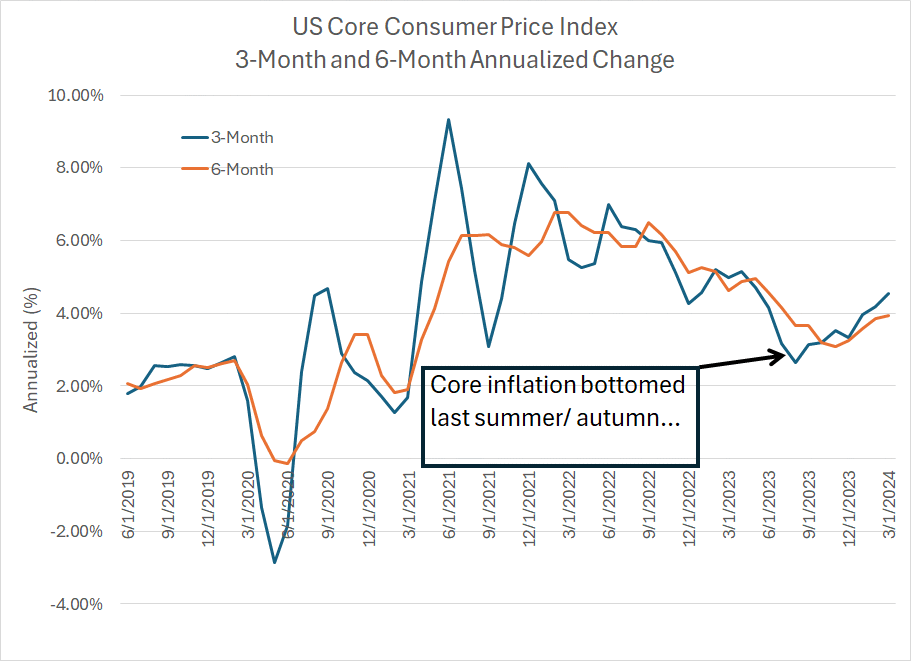
Source: Bloomberg
This chart shows the annualized 3- and 6-month change in the US Consumer Price Index (CPI) excluding food and energy prices (core inflation). As you can see, there was an initial surge higher in inflation in 2020-21 that peaked in 2022 and began to trend lower.
However, this period of disinflation is clearly over.
On a 3-month annualized basis, inflation peaked at over 8% at the end of 2021, fell below 5% in December 2022 and bottomed at 2.64% in August 2023. The March reading on this basis is 4.53%, more than double the Fed’s target of 2%.
Of course, the 6-month annualized change is a little slower to move; however, on that basis, inflation bottomed out at 3.08% in November and now stands at 3.94%.
This really shouldn’t come as a huge surprise to anyone.
A Quiver Full of Arrows
As Sir Winston Churchill once said: “A good knowledge of history is a quiver full of arrows in debates.”
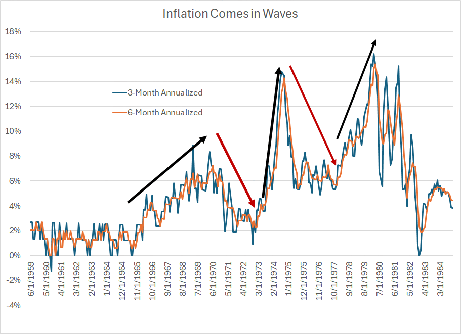
With that in mind, look at these two measures of inflation back in the 1960s, 70’s and early 80’s:
Source: Bloomberg
As you can see, US inflation was well-behaved in the early and mid-1960s and took a notable leap higher in the late ‘60’s – that’s the first black arrow on my chart.
Then, there was a notable disinflation from around 1970 to early 1973 (red arrow) followed by an even bigger wave of inflation into 1974. And, please keep in mind, this is core US inflation we’re looking at, so this doesn’t directly track the rally in oil amid the “Arab Oil Embargo” of October 1973 to March 1974.
Of course, the big spike in inflation in 1974 was followed by a further wave of disinflation into 1975-76 and a period of stable inflation at a high rate until late 1977. Last, but certainly not least, there was a final blast higher in core inflation into the early 1980s followed by a disinflation that finally “stuck” into the mid-1980s.
That’s the core inflation picture, so let’s turn now to commodity prices:
Paper Decades, Real Decades
And here’s a look at the Bloomberg Commodity Index over the same period:
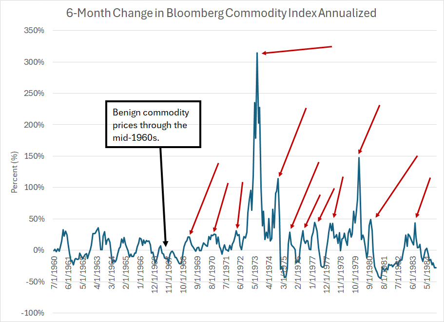
Source: Bloomberg
This chart shows the 6-month change in the Bloomberg Commodity Index on an annualized basis. As you can see, the commodity price backdrop was benign in the mid-1960s but began to turn more sinister in the late 60’s and early 1970s.
Commodity prices are notoriously volatile; however, you can clearly see the proliferation of “spikes” I’ve labeled with red arrows through the 1970s. And while the super-spike in the index in 1973 throws off the scale a little bit note that many of those smaller spikes in the mid- and late-1970s still show commodity prices rising at a 40% to 50% annualized pace.
That’s inflation!
One more chart:
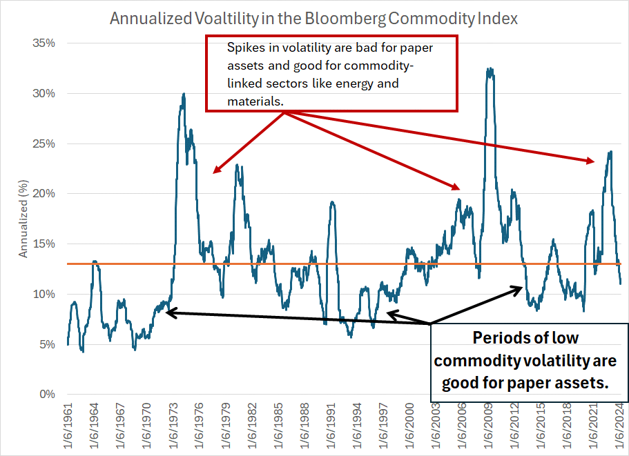
Source: Bloomberg
To create this chart, I calculated the 52-week trailing average volatility on an annualized basis since the early 1960s – that’s the dark blue line. The orange line is the average over this entire period of just over 13%.
When commodity price volatility is elevated, that’s a headwind for the economy.
The reason is that consumers must contend with wild swings in the cost of everything from food to fuel. Of course, businesses will struggle as well, balancing the need to raise prices to offset cost inflation while trying to avoid destroying demand for their products or services.
Sometimes you’ll hear economists refer to the 1970s as the “Stop-Go” decade, a period of booms and busts. This simple chart captures that effect pretty well in the form of a protracted spike in commodity price volatility to levels well above that long-term average.
Simply put, when commodity price volatility is low – generally below the orange line on my chart -- that’s a supportive environment for paper assets like stocks and bonds.
That was the case through most of the 1960s and early 1970s – the S&P 500 generated a total return on a dividends-reinvested basis of about 8.8% annualized from the end of December 1959 to the end of December 1972.
Low commodity price volatility was also the order of the day from the mid-80s, straight through the 1990s. True to form, from the end of 1984 through the end of 1999, the S&P 500 returned an even more impressive 18.9% annualized including dividends. Even bonds performed well amid this period of low real asset volatility – the Bloomberg US Aggregate Bond Index, an index of Treasury and investment grade corporate bonds – returned 9.21% annualized over the same period.
In contrast, periods of elevated commodity volatility are bad for paper assets.
The period from the end of 1972 through the end of 1982 would be one example as was the period from the end of 1999 through to the end of 2014. In the former, the S&P 500 returned 6.7% annualized, which looks even worse when you consider that the US headline inflation rate averaged 8.7% annualized over this period (i.e. negative real returns from stocks).
And from the end of 1999 to the end of 2014, the S&P 500 returned just 4.24%, worse than the Bloomberg Aggregate Bond Index gain of 5.7%. And, for the record, headline inflation over this era averaged about 2.27%.
Since 2014, of course, paper assets have largely prevailed. From the end of 2014 through the end of last year, the S&P 500 was up about 11.8% annualized; measured through the end of 2021,bbefore the 2022 bear market, the S&P 500 was up a little over 15% annualized.
Granted, bonds haven’t performed as well – the US Aggregate Bond Index returned about 3.3% annualized from the end of 2013 through the end of 2021 before seeing historic losses in 2022. However, some of that is a function of extreme accommodation from the Fed; the Bloomberg High Yield (Junk) Index returned about 6.15% annualized from year-end 2014 through 2021, not bad in a low-inflation world.
The biggest issue for equity markets right now is that we appear to be entering a new “real” decade – elevated inflation, and elevated commodity price volatility, both suggest a souring environment for paper assets much like the 70’s and 00’s.
The sector rotation we’re seeing so far in 2024, and more broadly since the end of 2021 – something I’ve been harping about for weeks now in The Free Market Speculator – is the tip of the spear for what’s likely to be a seismic multi-year shift in global markets.
Of course, it’s not likely to be a straight line higher for commodity prices – it never has been, even in the 70’s – however, I’m seeing more opportunities in real assets and related sectors that I’ve seen in a long while.
DISCLAIMER: This article is not investment advice and represents the opinions of its author, Elliott Gue. The Free Market Speculator is NOT a securities broker/dealer or an investment advisor. You are responsible for your own investment decisions. All information contained in our newsletters and posts should be independently verified with the companies mentioned, and readers should always conduct their own research and due diligence and consider obtaining professional advice before making any investment decision.
From the Volatility Chart, it looks like commodity volatility in 2024 will have to go down a bit below 10% then should go up. That could be a year or if history is a guide. I can wait.