


Reposting Older Work...
Reposting Older Work...
Moon and Ten Pence: More Lith Explorations

As I prep my new darkroom for its first prints I have been combing through the back catalog of my work seeking ideas to pursue. I thought since I have not been posting much in a while I would repost older work from my Blogger site. These are sessions I particularly enjoyed the results of. The first is below….
Moon and Ten Pence: More Lith Explorations
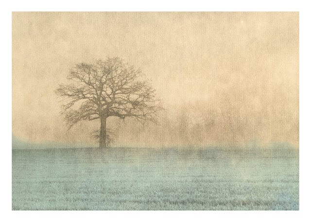
First of all, pardon the poor reference to Gaugin and Somerset Maugham. In my last post I mentioned the idea of creating an artificial moon (or sun) in the image and so today I thought I would try it. These things violate my sense of artistic integrity about which I have confessed some violations and written up some of my thoughts. Without going too deeply, the lith process brings out an image of a type that wasn't present at the time of its taking. In general, these lith images were much brighter, whiter, and more upbeat in mood in their conventional interpretation. Lith brings another mood and often adds artifacts that imply tonal variation that wasn't present. By this logic further manipulation doesn't seem that far off if it fits the subject and presentation of the subject even though it doesn't follow the 'law of serendipity' that lith printing follows.
I decided to use a ten pence piece to make my 'moon'. It is the smallest currency I have. I tried placing it on the paper itself as well as suspending it on a piece of glass above the paper during the printing. The former gives a sharp round outline while the latter gives a more diffuse edge. The height varies the diffusion of the edge and the diameter.
The other, and most difficult, variable of moon making is the exposure time. I tried a few different exposures. My aim was not to have a pure white orb, but this is remarkably hard to control with lith. I am also not sure now this is a great idea. Generally, if you print the moon or sun taken through clouds or fog this is the highlight of the image and so you tend to assign the brightest tone to it. Finally, the composition or placement and size of the moon must be decided. The size in this case is the ten pence piece. I settled on mathematics to match a rule of thirds in the upper right corner of the print. The tree rooted to the lower left corner of the rule of thirds.


This first image has the coin directly on the paper and looks fake. The sun can appear through fog as a sharp lined circle (I saw it do this one morning this week.) but it also has a penumbral glow which is not present, so it looks fake to me. The moon being fainter probably cannot pull off this trick of a sharp-edged orb as well.
The two attempts at a diffuse moon are much better.
Toning
This exploration, like yesterday's, is of two parts. Composition and toning.
I persisted in trying to sepia tone these lith prints again. Yesterday the prints were very resistant to sepia toning. I tried again today with a fresh batch of MT4 sulfur toner mixed 1+200. I placed the first print in the bath. This was one without an attempt at the moon. It sat in the bath outside in my garage where I worked to keep the fumes from affecting me or fogging my stock of photo paper. It sat for ages (10+ minutes) and had no effect on the image tone. Then I noticed, serendipitously, that parts of the image were getting the familiar brown sepia tone. It turns out these were areas exposed to sunlight. The areas in shadow remained neutral toned.

I have never read about this anywhere, so I verified this with a specific example above where the field in the foreground was sepia toned while the area above the horizon was left untoned. This was done by arranging a board over the sulfur bath with the edge of the shadow it cast directly aligned with the horizon. Since the entire print was soaked in sepia toner and some indirect light struck the image which results in a light sepia toning in some of the highlights. The 'moon' stays clear as it has no silver present.
This image I also gold toned the print which improved the contrast of the tree and other areas not touched by the sepia.
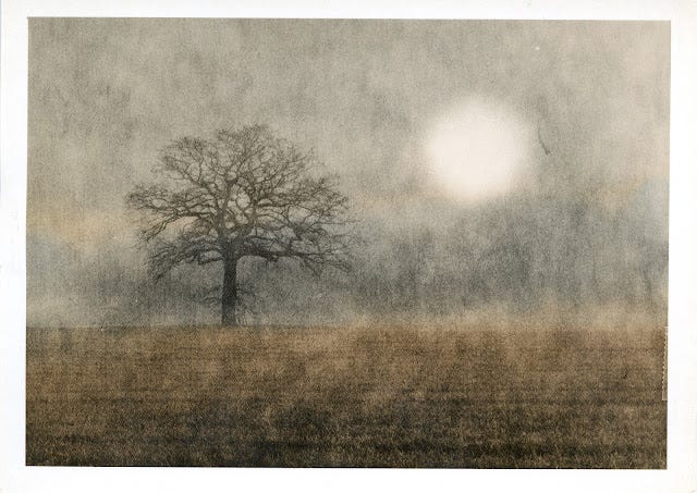
Overall, this image is nice. It looks like a painting and the tones impart a 3-dimensional aspect to the image.
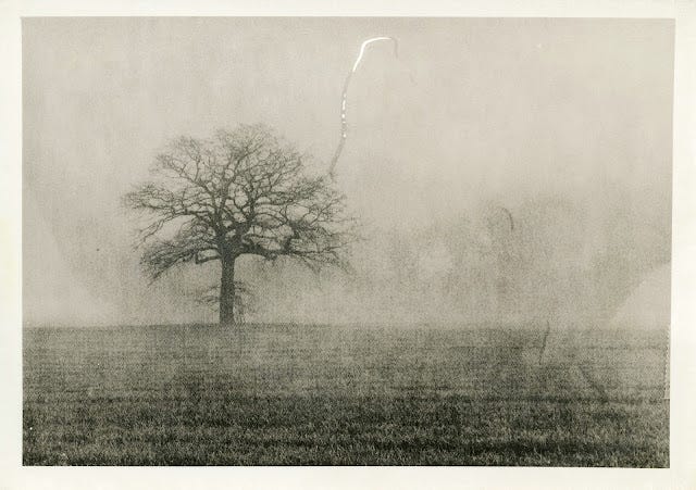
Smaller and Fainter Moons
After this first round, I made attempts at making a smaller moon but also tried to expose it less to get some tone into the orb. (As I mentioned above, I think this will end up being a mistake. I ran a series of exposure experiments. This time I used a piece of white plastic sheeting cut into a circle with a hole punch. Nothing appears in these attempts. The exposures may be too short, the circle may be too small when held at too great a height and diffusion permeates the whole image leaving little visual impact. Finally, it may be the white plastic is not opaque enough to block enough light.
I also refined the bleaching of the developed print to clear fog and yellowing of the borders. I tried just bleaching alone but overnight found a pinkish or yellow tone returned after washing and drying. This leads me to think I should fix the image as well to remove all the bleached silver. So, I rebleached these and then fixed and ran an archival wash process. This cleaned up the tone and fogging of the emulsion. This bleach takes less than a minute to remove this yellow stain/fog, so the highlights are hardly affected. I use Potassium Ferricyanide mixed as 1+9 from concentrate.


None of these images achieved what I set out to do. They may be useful for toning experiments.
My next step is to try for the smaller bright moon.
Smaller Moons
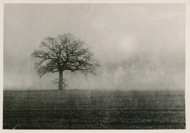
This session was better than the last. I managed to expose for smaller and more subtle moons.

This is the same size as the first session as it uses a coin again handheld in suspension above the paper to get the diffuse edge. Here I opted for 1/4 stop of the total sky exposure which results in a less well-defined light.

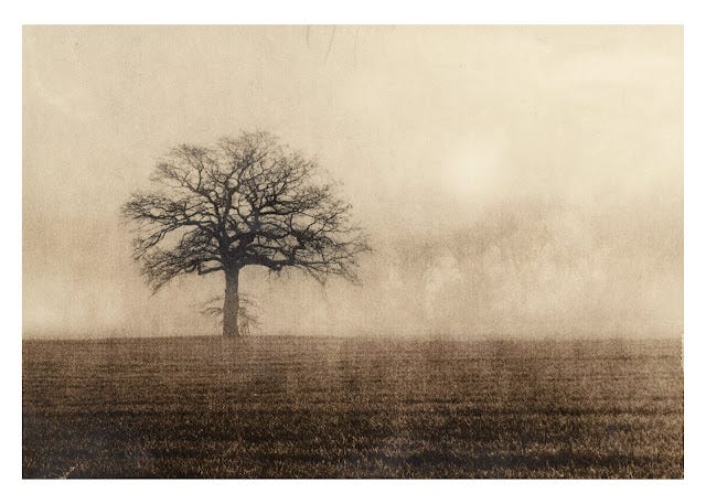
This time I used a paper punch of some heavy black paper suspended on glass and hand held over the paper. This makes a smaller orb, really just a white patch. This one was exposed with the 1/2 of the total exposure.
Another small moon as above, however, I reduced the exposure time in half. This still has the requisite contrast. Similar effect as the one above. Placement and timing of the sky burn on the horizon can create a lighter band just above the horizon that gives the impression of a band of heavy fog hugging the ground. The prior photo gives more detail of the background trees.

Another version, however, seems to be some development anomalies on the right side of the image.
Sepia, Gold and Iron Toning
I took these last four prints and applied toning to them. I present them in the order of the original images above. (They all have photoshop borders.) In general the gold toning brought up the mid-tones and darker parts of the image to good effect. The iron blue toning mostly stains the paper as the borders were a powerful blue color as well. This is some of my frustration with iron toning is that sometimes I don't want the highlights to come in so blue and this is because the paper picks up the color as well as binding to the silver.


This last image I reversed blue/sepia from what one might expect. Not impressive.
Darkroom EasyLith Film Photography Fohar Raster Lith Moersch MT4 MT6 Gold Toner MT7 Iron Blue Toning Nelson Gold Toner Photography Sepia Toning