

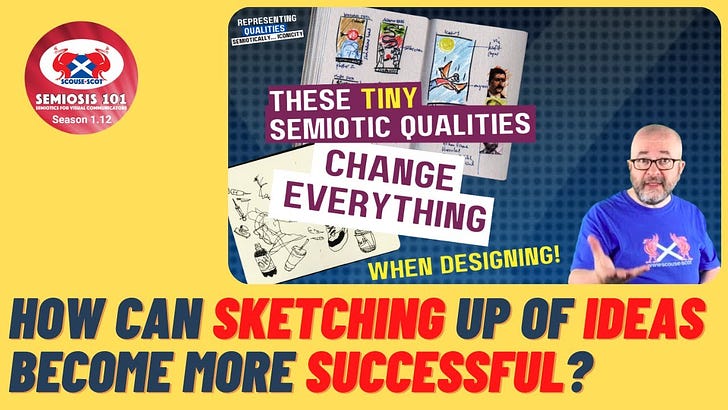
Free Transcript of Episode 1.12 These TINY Semiotic Qualities Change EVERYTHING When Designing!
Free Transcript of Episode 1.12 These TINY Semiotic Qualities Change EVERYTHING When Designing!
Semiosis 101 Season 1 Video 12 Transcript


Hello readers.
In this free transcript for the video published on Semiosis 101 on 2 Nov 2022, we dig deeper into what Peirce’s Iconicity means for illustrators and designers. Encoding Semiosis begins during ideation, so let us look at some professional sketchbooks to see how.
Watch the free video on YouTube for the full impact…
…and here is the video’s transcript.
NOTE: As with any video transcript the tone used is conversational. The following transcript text features ad libs, and therefore should be read in the spirit of any semi-scripted video.
Let us get to the twelfth Semiosis 101 episode on general Peircean semiotic theory for illustrators and designers. Over the last two weeks we have explored Iconic, Indexical and Symbolic representation from both an illustration and graphic design perspective.
This week in around [20-minutes],we will dig deeper into the lowest level of semiotic representation in Semiosis - Iconic - in order to understand in Pragmatic semiotic terms what it is and how it functions.
The Icon in a Peircean contextis not what you as illustrators and designers understand “icon” to mean. You will see when we discuss Iconic representation its Peircean meaning differs from your understanding and application of the word Iconic. So it is important to begin today with an open mind.
Words in different socio-cultural contexts have different definitions. Peirce wrote his Pragmatic semiotic theory in the late 19th and early 20th centuries. So to understand Iconic representation in Semiosis, in order to know HOW to apply it into Visual Communication Design, you must 'bracket out' any other definitions for the next [20-minutes] as we explore Iconicity.
It will be a theory-packed [20-minutes] of Semiosis but in designer-centric terms. So, stay tuned, subscribe, hit the bell, open your mind and let us go.
Okay. So here we are in this week's talk. We are going to be focusing in on Iconicity. What we mean by Iconicity is the first starting point of semiotic communications as far as graphic designers and illustrations concerned, which is the Iconic semiotic representation.
Now, this level of semiotic Representation of the Concept that we want to communicate is only one dimensional, and it is the lowest level at which a semiotic sign is perceived by our target audience. Now, that is important.
Our target audience - because that is who we are really talking about in these talks. Really. It is about how can you craft your visual communication using Peircean semiotic theory, to enhance how you effectively communicate to your target audiences. Whoever they are.
Now, in this [video], we obviously are going to be focusing on illustration and graphic design as our examples, while talking about Iconicity. So really what we are going to be using is examples of real designers' and real illustrators' sketchbooks. They are taken from these two books by Stephen Heller, and the links of these are in the description below.
So we got Stephen Heller's “Graphic,”which is about graphic design sketchbooks, and “Comics Sketchbooks.”From these two books, the examples I have taken are in the slides, but the links to these two books are in the description below. So check them out.
Okay. So let us move forward then. Iconicity. Representing qualities. We have already established in previous videos, that at Iconic level, that is when Interpretation from our target audience begins. What we mean by that is, as designers, your first visual communication task is to get the attention of your target audience, to look at what you have designed or illustrated. That is obviously done a lot through the aesthetic choices of the visual language you decide on, and how you put things together aesthetically. And in that “aesthetics” is the semiotics.
But when it comes to grabbing the attention of our target audience,we are not talking here about a leaflet which says, “buy your baked beans at the local supermarket.” We are not talking about denotative understanding of what they are looking at. If they want beans, [our audience] can go to the supermarket and buy beans. But, we are talking in the realms here of branding. We are talking in realms here of advertising. We are talking in the realms of more effective connotative meaning in your work, and making the audience work that little bit harder to get more reward from what they are looking at.
So connotatively, semiotics helps you as designers and illustrators, make connections through allegory, through metaphor, whatever it is you want to use to get across the big idea that is coming from your client’s brief. Now, your client is obviously who you are working for. The brief is what you are working from. And in the brief, is the message that your design or illustration needs to visually communicate, in some form or other.
That has obviously got to be to a target audience. And that target audience you have got to research. You have got to find out who that target audience is, what makes them tick and what makes them… connectable from your perspective …so you can hook [the audience] in. So if the audience you intended does not get interested in your work, then semiotics does not get a chance to work.
If [the audience] only see it at the denotative level, then [the audience] are only going to see what IT is and then move on. They are going to go buy a tonne of beans. But in advertising, they do not just go, “Buy beans.” They bring it round in a lot of different ways to tell a story. To tell a narrative. To get an emotional response from their audience. And in a way, even though you might not be working in advertising or even in branding, that is something that you want to…
ASIDE>I am going to use a term herefrom design company Carr Kamasa<
…“bake it” into your design. And this is your way of doing that through semiotics to help you craft it. Because if the audience does not spot something that has a “resemblance” to something that they already know… something they are interested in… then they are going to walk away… and semiotics does not get a chance to start working.
That is what we mean… is that at an Iconic level, that interpretation begins. That semiotic Interpretation, if you do not get it, [you are] going to carry on walking. If you do get it, then we [creatives] have got something to work on - semiotically - to craft… to get more meaning… from the work that you do. To be more effective in the visual communication that you are producing.
Okay? So… Iconic representation… In order to grab attention of our target audience… then as designers and illustrators, you can only convey a possibility of making that connection using something relevant in there, to HOOK our target audience in. So you are looking for shared “qualities” that Peirce refers to as, “Like that THING and used as a sign of IT.” So the Semiotic sign is something that represents the THING we want to communicate.
Okay? So really what we are talking about here is Iconic representation is the very basic building blocks of [visual communication]. So here are two examples.
We have got Sean Adams’ colour notes in his sketchbook using Pantone colours. And then on the left side, you can see within the layout, colour combinations to create a vibe, a tone, a feeling. No detail in there yet, but it is just something to try and emotionally grab attention. That is ICONIC.
And we got Carol Tyler, the illustrator Carol Tyler, obviously doing some sketching of potential compositions for a party scene. How do we know it is a party scene? Well, there is a big giveaway. Within all of this figure movement, is the fact that they are wearing "party hats." But they are NOT party hats. It is just a triangle. It is just a couple of lines and a few little embellishments. But if you know what a party hat is, you can see it is a party hat.
You can put it in the context of the figure movements and you know that these figures are in a party situation. So that is Iconic level of Representation within illustration, graphic design already working.
Let us move on. Professor Tony Jappy, a scholar in Peircean Semiotics, says “Iconic representation of a [Concept] is the lowest subclass that can operate as a sign, and only when it has a referring [Concept] to be interpreted.”
Now, obviously, I am talking here in designer-centric terms. So what I have done is, I have just replaced in yellow the word “Object” in Tony Jappy's quotes. And there is his book, there, there is a link in the description to this book. Check his book out. So in that, what we are talking about here, is for something Iconic to work, it has got to be related to the “message,” the meaning of which you want to visually communicate to our target audience.
Again, that determination flow… Concept and Object, those two things are the same… Representation and Representamen are the same, and… Interpretant and Interpretation are a pairing… of design-centric terms and Peircean terms together. Okay?
So what we are talking about here is obviously the Concept, and how the Concept is Represented. There is no point in Representing the Concept using things that our target audience have no connection to whatsoever. What do we mean by that? Okay, let us just look at these examples here from Joseph Lambert.
So we can see in his sketchbook there is typographical layouts using just shapes. But let us just focus in on these pen shapes at the bottom, the writing and drawing implements. At the bottom. We can see a square. Okay?
But they are just like lines forming what we perceive as a square. So if we see the square, we know when we see something like that, even though they are not right angles, it is referring to a square. So Iconically, it is working. But then we see all these red shapes, all working in blocks of colour, of red and the negative space.
So we are talking about here the “Figure and Ground” Gestalt theory, Figure and Ground. The negative space forces our eye into the shape of the red blobs, which, if you know what a fountain pen looks like, the second one along starts to look like a fountain pen. The fourth one along, if you look at the fourth one along and you know what a brush pen looks like, then all of a sudden that starts to make a connection to us, going, “Ah, that is a brush pen. And the other two are maybe markers of some form or other, or even crayons?” It is still very rough drawings.
He is still only trying to work out what these things are. But Iconically, we can start to see just these shapes and colours all of a sudden underneath the shapes as well. All of a sudden communicating something to us that we know we have experienced. We have experienced pens, we have experienced crayons. Even if you don't know what each of them are, you can at least get to the point of "they are writing or drawing implements." All of a sudden, these just few marks of red on paper… all of a sudden start to Represent things that we know… Iconic representation.
We know it relates back to drawing implements. So we know that these lines together in this way is telling us something about drawing or writing. If we didn't know what these shapes were, we would not make the semiotic connection, and they would just still be blobs as far as we are concerned. We would not be able to INTERPRET what they were.
Let us move forward again. Tony Jappy. Iconic representation… “can only relate to a [Concept] by qualities, as it ‘resembles a [Concept] through the association of shared qualities, whether that [Concept] exists or not.”
Okay. Let us unpack that again.
Iconic representation can only relate to a Concept by qualities. We are talking here… obviously, qualitatively. [I am not] talking here quantitatively, about facts and figures, and things like that. We are talking about feelings… and tapping into feelings… and things that our target audience experienced in their lives… that you can visually pull into your work as visual HOOKS to get their attention for us to then work later on… getting more and more information out of your visuals and your designs.
Those qualities, when you do that in your work, resembles those things that [the audiences] are aware of. When I say “resembles,” what do I mean? Well, we just had an example of that, of just a few brush strokes in red resembles marker pens, fountain pens, brush pens. Pens in general. Crayons, maybe.
So here we got a couple of examples again. We have Brendan Leach, a little sketchbook of observational drawings…just lines. Just lines. Just lines. But in those lines, put them together, we get to see that you can see a shoe. You can see a jar. We can see a glass. You can see a bottle. We can see the back of somebody's head. But they are just lines. That is all they are. They are just lines. They are just Iconic lines that, put in a particular way makes a connection to us that we can see, because we know what shoes and glasses and jars and people's heads look like.
Then we got Michael Beirut's little sketches of letter forms… just working on just very quick little thumbnail sketches. But those little lines, put down in a particular way, Iconically connect to letter forms that we know, like the M. Okay? We can see an M there. We can see that the M is being sketched out, but it has still something that resembles an M. It has got the qualities of an M. It has got the uprights, it has got the diagonals. It resembles an M. And from that we can make an interpretation of THEY are M's.
Okay?
Then we got Run Wrake in his example here, of these padlocks because they resemble padlocks, but it is still only drawings. But padlocks and faces? Putting faces faces and padlocks together… - bring the keyhole of the padlock [as] the nose on the face - All of a sudden, you can start to make characters out of padlocks or the opposite way around I suppose.
So obviously a padlock figure with a face does not exist, but the shoes and the glasses and the jars and the bottles do, and letter forms do.
So Iconic representation is not just of things that are in existence. They are things that we know that when we put things together, juxtapose different things together, all of a sudden new meanings happen. And that goes right back to the dawn of humankind. We have had this ability for abstract thinking, and semiotic theory.
Peircean semiotic theory just builds on that innate humanness, of being able to spot patterns with Gestalt, and from that to actually start applying those patterns in a particular way as a [semiotic] sign for something else - a bigger idea - a bigger concept that you are not denotatively saying, “Right, this is THIS,“ you are saying, “Look at this, THIS is THAT.” But, if you get to that…Great. But if you do not get to that, at least you got the Iconic level HOOK of people going, “Oh, that is interesting, look at that, there is a figure there with a padlock head.”
Alright, Iconically, it is working so far - Semiotically. But what is it actually communicating? That comes later. Okay? And some audiences may never get to there. But, we will talk about that in future videos. Okay, so a semiotic sign begins to function at an Iconic level of the Concept through resemblances to things that the target audience already knows. So here we can see in Amy's quick sketches, that we are talking here about human heads, mostly male human heads, judging by the beards.
So within this, just a few Iconic lines and some shapes and different weights of colour, or in this case, black, thin lines, heavy lines, heavy black shapes. You can convey SOMETHING that is not there, which is basically a human figure. There are no eyes, there are no noses, there are no mouths. But we (through Gestalt) can fill in the rest of the details because we know what a face looks like and THAT resembles faces to us. That resemblance is [at an] Iconic level.
So every line, shape, colour, etc. you make in your sketches or final outcomes are Iconic. And that is the point I am trying to make here. Okay?
I will leave it for academics [to] argue whether or not I have been really accurate in my description of Iconic in the roles of Peircean semiotic theory, but put that in the comments below and we can argue that later on. But from a point of view of a creative, talking to creatives, with that little bit more knowledge of Peircean semiotic theory than the viewers, this is the way to start to unpack Peircean semiotic theory to make that relevant into your design practice.
Now, if you think of every line, shape, colour, etc. you make in your sketches or final outcomes are Iconic.
They are the things that start to get people's attention. And yes, we are talking about aesthetics here. We [will be] talking about aesthetics in a few videos time, [a couple of months time], but we are really talking about here is the fact that you can consciously begin to craft, at an Iconic level, your aesthetics to effectively grab the attention of your intended target audiences, much better than you probably currently are.
Okay, so let us just start to wrap up this week's talk. So think of Iconic representation as the building blocks of all Visual Communication Design. So from your sketchbooks, out to the finished designs and finished illustrations you do; if you now start to think of it in this way, then you have always have been “doing semiotics.”
How well you have been doing semiotics, that is another discussion for another day and for your own self-reflection on that. But really what we are talking about here is crafting things from the ideation stages, after you get the brief, all the way through the design process, illustration process, right into the Interpretations by your audiences and the analysis of how people then interpret what you have designed.
OK, so we are talking about long life here, where semiotics fits into all those areas. OK, so that is where we are coming from within this one. So Iconicity is based on at least perceived resemblance …and Chandler talks about that in his book - [the link to] is in the [description] below.
So Iconicity is based on at least perceived resemblance of the Concept, using shared qualities that help TRIGGER recognition in the mind of the target audience. And it is that thing there, that word “qualities” and that word “trigger” that connects to “resemblances.” So by understanding your target audience, first of all… What is their lived experience? What have they experienced? What are they familiar with? Then you can start to get a sense of… “OK, when I put down colours, lines, shapes, etc., then if I just shift it towards the target audience's experiences, the things that [the audience] know… the things that they will be able to interpret…”then by crafting those qualities, you can TRIGGER in your target audience that sense of… “Wow, okay. I want to look at this more.”
Okay? It may only be a leaflet on buy the best beans from the supermarket …but it can be done in many different ways, to really get people to go…“Actually yeah, I really, really want those beans” or “I really want THIS,” or “really want THAT,” or “really want to do THIS.” And that is what Jorge Frascara talks about in his book about Visual Communication Design as being a behavioural changer in our target audiences. And very much so.
That is where I bring semiotic theory in to help you facilitate how you make that connection to your target audience, to trigger recognition in them, in the mind of the audience, for them to actually go “Oh, this is intriguing, what is this?” Obviously that is done at a subconscious level. They are not talking about that as an open dialogue. They are talking subconsciously about that, and that is what you want toTRIGGER in [the audience] - the recognition - so that you grab [the audience’s] attention.
There is going to be a video in a couple of months time on reducing visual NOISE to help that ‘trigger recognition’ come forward. So click the bell, click subscribe, and ensure that you are aware of that video when it comes live. Okay?
So a new thing that we are going to put into these videos now …the first eleven videos were just setting the scene… (So you can look back [at] the first eleven videos and the first three omnibus) …they were just setting the scene for Peirce and Peircean semiotic theory of Semiosis.
So now that we are through that, we are going to be giving you a little bit of homework as such, but just something as a takeaway. So this week's bite size piece of applicable semiotic knowledge is that during your ideation, in your sketching of ideas, consider as you sketch, …can someone else understand your sketched ideas?
Okay, so you are sketching them, and I say this all the time with students. They are very shy of drawing because they think you have to be Leonardo Da Vinci, but they are not. You just have to have a good sense of Iconic crafting, of initial sketched ideas, to get that recognition in somebody else. So obviously it is in you, but also somebody else seeing what you are sketching and go, “Okay, I can see what you are trying to do there.”
OK, that can just be within a design team. It can be within your student body, around your table, but that ultimately has to then link to your target audience. So can you ensure your sketches resemble things that your target audience already knows? That is the next level of that. So we all do the first bit, we all sketch ideas out and in that sketching of the ideas we are trying to make sense of the things that are in our head. And get it down our hands, through our fingers, through our pens and pencils, onto paper and get it out there so we can start to work on that. And I want to encourage everybody to still do that, preferably on paper rather than digitally.
But once you got that initial phase down, look over and go, “Okay, my target audience is THIS”. [The audiences] have experienced this and they got triggers here, there and there. How can I shape the colours? How can I choose the colours? How can I choose the lines to resemble more the things that [the audience] know?
So by doing that, the crafting stage, as you are developing your ideas, then you are hard “baking in” …again using Carr Kamasa’s techniques.
ASIDE > So there you go Sanjay,I got that in there.<
You can by carefully considering the Iconic crafting and that is what I am talking about here, the Iconic crafting of your visual language. From a very early sketching stage, you can help to start to enhance how your final designs will make better connections to your target audience.
You will be happy, your target audience will be happy, your client will be happy, and your client’s bottom line …financially… will be happy, because hopefully all of these things will be a win-win-win-win situation. And what will help you get there is a clearer understanding of how to apply Peirce’s semiotic theory of Semiosis at an Iconic crafting level into your work to enhance how you visually communicate.
Okay, so that is it for this week. Come back again next week where we are moving up one level to Indexical. We are going to look at Indexical in as much detail as we have done here, and then move that, in the next week after that, up to Symbolic again.
Okay? So remember, subscribe, hit the bell. Leave a comment below. And that is it for this week.
Watch the free video on YouTube for the full impact…