

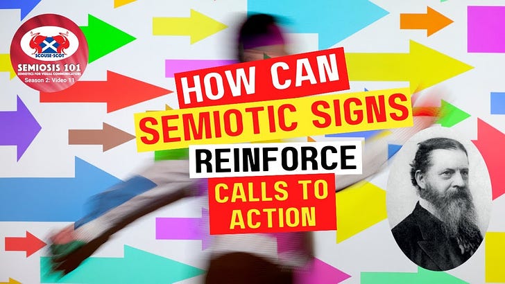
Free Transcript of Episode 2.11 How Can Semiotic Signs Reinforce Call To Actions?
Free Transcript of Episode 2.11 How Can Semiotic Signs Reinforce Call To Actions?
Semiosis 101 Season 2, Video 11 Transcript


Hello readers.
In this free transcript for the video published on Semiosis 101 on 5 July 2023, we discuss how can graphic design and illustration change behaviour? This is a big question. Visual communication outcomes are not passive. They call for people to interact …and therefore act.
Watch the free video on YouTube for the full impact…
…and here is the video’s transcript.
NOTE: As with any video transcript the tone used is conversational. The following transcript text features ad libs, and therefore should be read in the spirit of any semi-scripted video.
Jorge Frascara describes what we do as visual communicators as behaviour-changers. This is quite an elevating statement, one that lifts designers’ and illustrators’ status from perceived ‘decorationists’ to actual communicational facilitators.
With great power comes great responsibility.
Okay, let us put this into a humble context.
Last week we discussed the aesthetic in a Pragmatic context and demonstrated how to semiotically craft this from the Iconic level of representation up. This was framed within a determination flow at both the macro analogue level and the micro sign-action level. At the micro level of Pragmatic semiotic sign-action (Semiosis) communication flows between a Concept, its Representation, and its Interpretation, back to the Concept. (Peirce’s terms are Object, Representamen and Interpretant). At the macro design level, there is a relationship between the client, the creative and the audience.
We established that a binary relationship just between the client and the creative is…incomplete communication. Sorry to say this but… visual communication is not art. There I dropped the truth-bomb! Of course designers and illustrators can be artists as well as visual communication designers. It is all about intent.
In 2008, Professor Simon Biggs, one of my PhD supervisors at Edinburgh College of Art, succinctly summed the difference up to me which I have used ever since.He said, “artists ask questions, designers solve problems.”
There may be many shared technical, artistic, philosophical and creative qualities, but designers and yes illustrators (I was one once) work to a brief. That brief comes from a ‘client’ (let us avoid subjective self-directed briefs) and objectively the designer/illustrator needs to answer that brief. Many of us professionally used to just focus on that brief/outcome binary. The client wants “this” produced, so I will produce “this.”But did the intended audience for “this” actually want/need/desire “this”? Or did intended audience actually want/need/desire “that”?
With the emergence in the 1990s of Interaction Design as a discipline, all designers and illustrators began to be exposed to the needs of the “audience.” Experience design emerged. User-centred design emerged. People emerged. But how to design for people you do not know?
It is okay for big design agencies like IDEO and Apple who employ psychologists and social scientists to find out this information. But what about the individual creative or small agency who cannot afford audience research? The answer to this is in plain sight.
Semiosis.
Peirce had philosophically influenced Interaction Design, and those of us in Visual Communication Design who were aware, began to synthesise Peirce into our discipline. (Do you want to know more? Check out for free the relevant chapters in my PhD, available on the University of Edinburgh archive).
I am quickly paraphrasing a lot of information here, so Peirce’s semiotic theory of Semiosis is different to Saussure’s/Barthe’s Semiology. Semiology is dyadic - Signifier/Signified Peirce’s Semiosis is triadic - Concept/Representation/Interpretation (put in designer-centric terms!)
If Concept aligns with the ask and needs of a client’s brief… If Representation aligns with the creative’s visual outputs and aesthetic choices… Then who does the Interpretation?
Yes, the target audience.
But what do they interpret?
One of the many similar comments I get asked by young creatives getting to grips with this, is why?
Why… is a natural question.
What the agenda behind “Why?” actually is is not asking why interpret or why semiotics? It comes from a good-hearted position, but one that under-values their abilities …or power to visually communicate. We have dealt wit denotation briefly in past videos. Let me simply sum up the perceived problem.
If a client brief asks the creative to come up with an outcome to make people buy more tins of beans, why not just say “Buy Beans!” and be done with it. Bish, bash, bosh. Job done. An illustrated poster of a tin of beans with BUY in big letters. Job’s a good’un. Denotation at its simplest. But do people want to buy more beans? Denotation is not what we are focussing on here on Semiosis 101, when we discuss applying semiotic theory. We already know that target audiences are more sophisticated than a denotational level of direct visual communication. For behavioural change to be enacted, as Frascara frames it, goes far beyond simple naked commercialism.
Any piece of effective visual communication will provoke an action, whether this is intended, or not. A great illustration is not just aesthetically wonderful to look at, it helps the intended audience to connotatively understand the themes of an article or to facilitate a page turn in a book to continue reading. A beautifully typeset page may offer the reader information in the form of words, but also the entire design can connotatively suggest richer narrative themes to support those words.This is why aesthetic decisions are always more than mere decoration. Aesthetic decisions of colour, shape, text, image, composition, hierarchy, proximity and tone can all be enhanced with semiotic signs.
The applied sign-action (Semiosis) within the aesthetic grabs attention, and allows the audience more time to discover richer levels of embedded meaning for themselves. The “Why?” question is more about the determination flow, and the relationship between the intended audience the client wants/needs to connect with. We know people will not “Buy Beans” just because a poster tells them to. After all, we are people too and we are not that unsophisticated (or gullible).
Recently, I was talking to Masters design students about basic graphic design tips to design their information posters about their work placement. I asked the postgraduate designers a question. I asked them to describe one piece of visual communication they walked past on their way into class. Put on the spot like that, the Masters students could not remember one example of visual communication they had encountered since leaving their home. They realised they had encountered a lot of examples, but did not take any notice.
It was all just ‘visual noise.’
So how, as creatives, do we achieve success if our outputs are always in direct competition in 21st century societies with other outputs, and risking audience visual overloads? We reframe our visual communication task. We are not competing for everyone’s attention all the time. Nor can we be successful if we were.
The client and their brief will target an audience. The creative can coolly, calmly and economically begin to create outputs to connect with THAT target audience through simple, achievable Iconic steps. You do not even need access to in-depth audience research to begin to do this. Before any visual communication output can enact a (desired) behavioural change in the target audience…
…buy, sell, do this, do not do that, go here, see this, read this, etc.…
…the audience need to perceive this “thing” [insert outcome] as someTHING relevant to them. This perception is triggered through the Iconic level of Representation of the Concept the client wants to communicate. (Check previous Semiosis 101 videos as to what Iconic means in the context of Semiosis!)Within a chosen aesthetic to grab the attention of the audience, whether in graphic design or illustration outputs, the perception triggers are qualities that represent things the audience already associates with the thing the client wants.
This information is found in the lived experiences of the target audience. This is socio-cultural in nature, and can form the basic building blocks to success.
To end this eleventh season two video, we can conclude by showing how this lived experience insight can suggest qualities to embed in your aesthetic.
Firstly, we are all human. We all encounter the world each day.We all grow up within a dominant culture, with its own cultural reference points. But we also are exposed to many other sub-cultural and cross-cultural visual stimuli. Some we like. Some we do not.
Looking at people’s shared experiences within the remit of a particular target audience can begin to suggest clues to qualities that people will respond to. It is in examining the qualitative experiences that generally appeal to THAT audience, that the Iconic visual building blocks can be harnessed to reinforce the call to actions.
Come back next week as we will go deeper in the next three videos into Experience Design.
Watch the free video on YouTube for the full impact…