

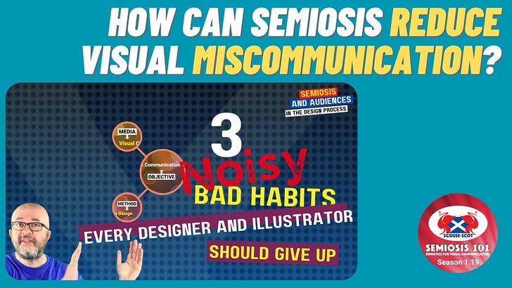
Free Transcript of Episode 1.19 3 Noisy Bad Habits Every Designer and Illustrator Should Give Up
Free Transcript of Episode 1.19 3 Noisy Bad Habits Every Designer and Illustrator Should Give Up
Semiosis 101 Season 1 Video 19 Transcript


Hello readers.
In this free transcript for the video published on Semiosis 101 on 15 Feb, 2023, we will refocus on our AUDIENCE again …semiotically speaking… and three “noisy” bad habits designers and illustrators should improve by improving your application of Semiosis.
Watch the free video on YouTube for the full impact…
…and here is the video’s transcript.
NOTE: As with any video transcript the tone used is conversational. The following transcript text features ad libs, and therefore should be read in the spirit of any semi-scripted video.
Welcome to this week’s talk. If you have watched the other videos in season one of Semiosis 101, you will realise Peirce’s terminology and ideas take a lot of effort to then adopt without some Semiosis 101 facilitation.
Do not get me wrong, Peirce’s theory of Semiosis is very valuable for visual communicators of all types. It is a pity it is not written in a designer-centric way. So, as season one comes to its conclusion, we end on two semiotic videos that segue nicely into where season two will begin. Yes, in this penultimate video we will start with some design bad habits to show where Semiosis can you overcome them.
In the next 10 minutes or so we will examine three “NOISY” mistakes that all illustrators and designers can semiotically avoid. In any designer’s or illustrator’s output it is intended to visually communicate someTHING to someone. This is your target AUDIENCE. So, it is up to you to ensure you do not miscommunicate.
With me so far?
We accept that we have an INTENTION to communicate someTHING visually to someone.
Yes?
Our client wants us to visually connect with their intended AUDIENCE, to get their message across from the brief they gave us. When we talk about semiotic sign-action of “signs” we are not talking about signage or wayfinding. The “signs” we are thinking of are visual “hints” to help the AUDIENCE’s perception. These visual perceptual “hints” can take many forms, but must align with the AUDIENCE’s prior EXPERIENCES. So we need to consider their AUDIENCE in our visual communications. Semiosis helps us to do that.
There are two non-semiotic terms that frame how we can visually communicate:
• A literal approach DENOTES what we explicitly SEE is what it explicitly IS.
• A lateral approach CONNOTES what we see is SUGGESTIVE of something ELSE.
To CONNOTE is to suggest or imply other associations beyond the obvious using analogy and metaphor. An illustration of a glass of beer in an advert is DENOTATIVELY a glass of beer. BUT…CONNOTATIVELY… The glass of beer illustration may be used as being visually analogous to something else, or a metaphor for a concept other than beer. In Visual Communication Design, we can apply semiotic theory into our practice to imply meaning beyond the denotative level. How?
With Semiosis. By crafting the sign-action you can help your AUDIENCE make lateral jumps in their perceiving. In designing and illustrating, the composition, the type-setting, the choice of colour, the crafting of the aesthetic can visually suggest more. Applying Semiosis can enhance how illustrators and designers can improve your effectiveness to do this. The aim of effective visual communication in illustration and design is to…
• get noticed by the intended AUDIENCE…
• be understood by that AUDIENCE…
• AND be remembered by that AUDIENCE.
So what design decisions can lead illustrators or designers to miscommunicate?
There are too many variables to cover here, so we are only going to focus on three bad habits that can negatively ADD visual NOISE. This visual NOISE gets in the way of effective visual communication, but with a basic application of Semiosis thinking to your visual elements, then your communication can be enhanced. The three NOISY bad habits we will focus on are:
• Inappropriate Colour Use,
• Visual Clutter
• and Unnecessary Decoration.
What is inappropriate about colour use?
We can frame inappropriate use in many different ways BUT, we will just focus on how colours can be inappropriate to your target AUDIENCE. Your colour choices can strengthen (or kill) your visual communication, as your colour choices are dependent on the psychology of how your AUDIENCE perceives them.
Colour choices have socio-cultural impacts. Semiosis involves the AUDIENCE. So applying Semiosis helps you to be more considerate in what colour means to your AUDIENCE. This begins at the basic level of crafting semiotic Iconic representation. On a basic level, colour affects our perceptions. It can help determine how our AUDIENCE will perceive the design or illustration’s content, and ultimately the desired meaning from it. But beware, colour is psychologically and culturally defined.
Colours can have different meanings within different cultures around the world. If you are not careful you could say something you did not intend. Colour is excellent at defining a visual experience, stimulating liveliness and interest or calming the viewer. But some colours can prove problematic as their meanings within different cultures can be diverse. Green, for instance, is associated with ecology and nature in the West. But in non-western cultures, it can also mean corruption and infidelity. Your colour choices are a basic semiotic signs. Therefore your colour choices affect how your AUDIENCE will understand it.
Our second NOISY bad habit is visual clutter. We could just dismiss this as inappropriate composition choices. We are all guilty at times with adding too many visual elements, which then overpowers the attention of our AUDIENCE. An overcrowded composition confuses the AUDIENCE as to where to begin. Ask too much of your target AUDIENCE and they will switch off and move on to something else… …TL:DR.
We are not advocating a minimalist approach here, but like with inappropriate colour, it is about facilitating the AUDIENCE’s perception of where to begin. In Semiosis, the AUDIENCE is key. It is their interpretation that we need to facilitate. So, through more careful crafting of the visual entry points to HOOK the AUDIENCE in, visual clutter can be reduced to only what will semiotically retain their attention.
We will move to this facilitation very soon, but first let us focus on the final NOISY bad habit - unnecessary decoration. The NOISY bad habit of unnecessary decoration in a design or illustration is usually perpetrated by either:
• listening too much to what the client likes;
• or by a lack of confidence in your composition choices.
Personally I avoid and resist the term “Visual Design” in favour of the more accurate term “Visual Communication Design.” Visual Design is too lazy a term, that leads to a reduction of what we do to just “decoration” - or the aesthetic. Whereas, Visual Communication Design centrally places communicating within our creative practices. The aesthetic is therefore an important HOOK to get the attention of our target AUDIENCE. Those HOOKS’ effectiveness can be enhanced with careful use of Semiosis.
The visual NOISE from Inappropriate Colour Use, Visual Clutter and Unnecessary Decoration reduces AUDIENCE perception. So how can Peircean semiotic theory help designers and illustrators to improve your visual communication skills? How can Semiosis reduce these three NOISY bad habits, to enhance our AUDIENCE’s perception and interpretation?
Well, in Semiosis (sign-action) how a designer or illustrator begins to visually REPRESENT THINGS in their work, impacts directly on the effectiveness of how the AUDIENCE will perceive. Adding too many visual elements (in the hope that some of them will do your visual communication job for you), and only focusing on an aesthetic for aesthetics sake, both are counter-productive.
How designers and illustrators can reduce these three NOISY bad habits to improve the AUDIENCE’s perception, is down to their choices of semiotic REPRESENTATION. Visual clutter and unnecessary decoration are two sides of the same NOISY composition coin. This is why the semiotic determination flow in Semiosis helps designers and illustrators to reduce visual NOISE and miscommunication.
The important designer-centric semiotic mantra to remember is…
• Concept >
• Representation >
• Interpretation >
• Message
The Concept is how designers and illustrators effectively communicate the important message in our client’s brief. The Representation is how you go beyond a denotative aesthetic level, to semiotically craft effective visual HOOKS to connect with your AUDIENCE. If illustrators and designers embrace the sign-action of Peircean semiotics, your visual communication enhances the AUDIENCE’s ability to perceive, INTERPRET and understand.
That is it for this week.
Come back next Wednesday for the final season one Semiosis 101 video. We will focus on semiotically facilitating behavioural change in our AUDIENCES.
Watch the free video on YouTube for the full impact…