

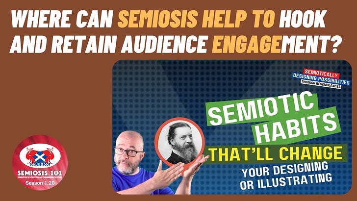
Free Transcript of Episode 1.20 Semiotic Habits That’ll Change your Designing or Illustrating
Free Transcript of Episode 1.20 Semiotic Habits That’ll Change your Designing or Illustrating
Semiosis 101 Season 1 Video 20 Transcript


Hello readers.
In this free transcript for the video published on Semiosis 101 on 22 Feb, 2023, we will look at three pieces of good semiotic sign-action to change how you design or illustrate.
Watch the free video on YouTube for the full impact…
…and here is the video’s transcript.
NOTE: As with any video transcript the tone used is conversational. The following transcript text features ad libs, and therefore should be read in the spirit of any semi-scripted video.
Welcome to this week’s talk, and the final video of season one.
In season one of Semiosis 101 I have covered all the main entry points for designers and illustrators, to Peirce’s semiotic theory of Semiosis - sign-action. All discussed in designer-centric terms. This final video will be a plenary to put season one into a visual communication context. This plenary will focus on three pieces of good semiotic sign-action that can change how you design or illustrate.
The three semiotic habits are…
• craft the aesthetic Iconically…
• centre your AUDIENCE in your visual language…
• semiotically HOOK their attention and keep them engaged.
To begin to semiotically change how you work, the first step begins with your AUDIENCE.
Who are they?
What do they already know?
What are their experiences?
These starting points will benefit you. The aim of effective visual communication:
• is to be noticed,
• be understood
• and be remembered.
This is not by fellow creatives but by our target AUDIENCE. The aesthetic we employ in our work gets the AUDIENCE’s attention. It gets their notice …or not. After all, aesthetics is quite a subjective thing.
So how can we as creatives, as illustrators and designers, win when the subjective cards are against us?
After all we cannot please all the people all the time, right?
Well, that is why we describe our AUDIENCE as “target.” That narrows the field from EVERYONE to these people who are X. It is in understanding the common factor “X” in our researching of our target AUDIENCE that we get keen insights to who they are, what they have commonly experienced, what they already know. Even a basic and cursory examination of who our AUDIENCE will be will prove beneficial for any designer or illustrator.
My late father was bespoke tailor - a craftsman - who always despaired over “off-the-peg” general garments. While that always made me laconically smile, he did have a point which stuck with me within a different creative industry. We spend time in our design school education to develop the technical skills within our specialism to do the job of designing and illustrating. But when do we consider what the AUDIENCE would appreciate rather than what the client wants?
We learn that as we get more experienced - and improve our effectiveness. Peirce’s Semiosis offers us a semiotic structure to enhance our effectiveness within his determination flow…
• Concept >
• Representation >
• Interpretation >
• Meaning
…so let us explore that further.
If our three good semiotic habits are…
• craft the aesthetic Iconically,
• centre your AUDIENCE in your visual language,
• and semiotically HOOK their attention and keep them engaged… how does the determination flow help our practice?
The Concept is how we will visually communicate the client’s message. The Representation is how we choose the best visual language to achieve that - the aesthetic, the tone of voice, the colour palette, etc. The Interpretation is what the intended target AUDIENCE does. Any visual NOISE, any miscommunication from the choice of visual language, can make an aesthetically crafted piece of design or illustration to fall FLAT!
Semiosis… helps designers and illustrators to hone their visual language to avoid miscommunication and visual misfires.
How?
Unlike other semiotic theory that is dyadic (two) Semiosis is triadic… the AUDIENCE is embedded. So the first good semiotic habit to employ is to craft the aesthetic Iconically.
To think of the visual building blocks of your aesthetic’s visual language, from an AUDIENCE’s perspective. Okay. This can be, at face value, seen as extreme micro focussing …but stay with me.
We saw in videos 1.10 - 1.12 how the basic semiotic building block of visual meaning is Iconic representation. Forget all the other meanings for Icon or Iconic you know. The Peircean Icon is the first level of sign-action to represent the intended Concept. Think Iconic representation as a “resemblance to” or “that reminds me of,” rather than “exemplary, classical, seminal, important, etc.” Think of a semiotic Icon as an element of semiotic representation rather than a religious or UI image.
(Peirce uses terms in a very specific way).
Therefore to craft your aesthetic visual language from the Iconic level up, now needs to be put into context.
In videos 1.10 and 1.11 I used an illustration and a branding campaign to demonstrate how, at the Iconic level of semiotic representation, designers and illustrators can select lines, shapes, colours, marks, textures, etc. - basic visual building blocks - to build meaning at a very basic visual level. By embracing the idea that with more thought, these basic visual elements can be semiotically crafted, to provoke an action in our intended target AUDIENCE.
Recognition.
A raw recognition.
Just enough to get the AUDIENCE’s attention. Just enough for them to subconsciously be HOOKED with a visual element within the aesthetic, that resembles something they recognise. In that micro second we can draw them in further. This visual crafting of Iconic elements, to build your visual language into an effective aesthetic, is in the power of all illustrators and designers who pay attention to sign-action. By being mindful of the crafting of the basic visual building blocks of your visual language, you are naturally centring the target AUDIENCE.
By considering them through any research you have on them (however basic this may be), you are beginning to strengthen how they will react on a subjective level to what you need to visually communicate. If you were to focus test designs a focus group will say one thing, but away from the focused questions of a panel, actually do something else. This may be a subconscious action. We are human. We cannot help being fallible.
But Peirce was ahead of the curve here.
Remember, a semiotic “sign” is a visual HINT to nudge the AUDIENCE from mere “noticing” to actual “engagement.” This invokes phenomenologically subconscious decisions to engage more deeply with our design or illustration. Ultimately, any visually communicated meaning is mediated by our aesthetic choices and visual language. Semiosis just helps us to make better informed decisions at a semiotic level.
The more semiotic HINTS the AUDIENCE responds to moves our ability to successfully visually communicate toward our intended objective. Mediation of meaning is high on Peirce’s agenda for Semiosis. Through centring the AUDIENCE when crafting the visual language, we can tune those visual HINTS to what the AUDIENCE will respond to. A subtle choice of colour here, a shape that resembles a familiar thing they know there.
Iconically we facilitate that mediation of meaning. Now how does that crafting of Iconic representation, centred around our target AUDIENCE’s prior experiences, HOOK their attention? Well, in videos 1.16, 1.17 and 1.18 we explored the states in which semiotics begins to work right to the point of general mediation of meaning. In our conscious waking hours, everyday there are moments when we are NOT aware of something. Then we BECOME aware.
It is that subconscious switching that Semiosis - sign-action - begins to work. That is dependent on our AUDIENCE noticing our embedded visual HINTS at a basic semiotic level, to HOOK their attention. Once hooked, our visual language and aesthetic then needs to work hard to retain the AUDIENCE’s interest. So we need to move semiotically up our representation of the Concept from Iconic, through Indexical, to Symbolic.
We saw in the omnibus 1.4 and 1.5 videos examples of how to keep the attention of the AUDIENCE. You can frame this as creating communicational situations in which you semiotically facilitate the AUDIENCE towards your objective, one visual HINT at a time.
(And here’s you just thinking you are just designing or illustrating!)
I know so far this all seems to be abstract thinking around how we visually communicate. “I just design/illustrate” I hear some of you cry! That is fine. Peirce shows us, through Semiosis, how to work smarter and more efficiently. Why not join him?
If Semiosis 101 season one began to share Peirce’s ideas using more designer-centric terms, season two will go deeper.
Come back next Wednesday for a season two preview on the Semiotic Rosetta Stone in Design [and Illustration].
Watch the free video on YouTube for the full impact…